Case study
The company
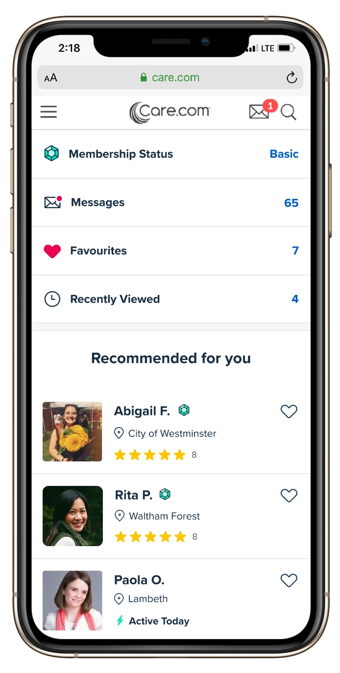
Care.com is an online matching platform for families and caregivers. It operates across seven different verticals and is available in 16 countries.
The international team, based in Berlin, is responsible for all countries outside the US.
How it works
Care providers sign up and create a profile with their personal info, location, skills, work preferences and previous experience.
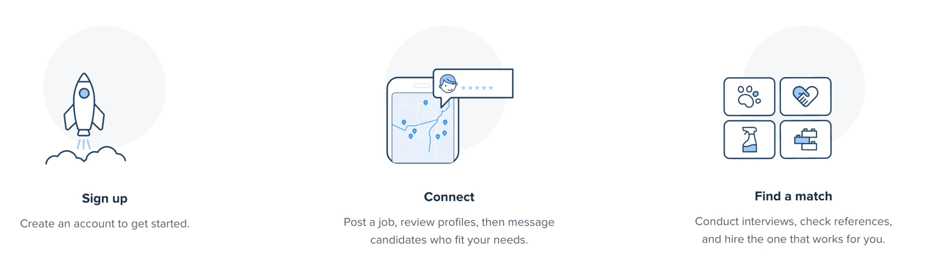
Families looking for a caregiver browse through profiles and contact potential matches. To be able to contact each other, care.com members need to upgrade to a premium account.
All members are called “basic users” before they upgrade, then they become “premium”.
Project Context
Families seeking a caregiver need assurance that the person they hire is both trustworthy and competent. Reviewing provider profiles is their primary way to assess potential caregivers before deciding to make contact.
The business model relies on users upgrading to a premium account, as Care generates revenue primarily from these upgrades. Key features, such as contacting providers, are exclusively available to premium users. Therefore, profiles play a crucial role in convincing basic users to upgrade. They must demonstrate quality and uphold high standards.
At that moment, families were becoming frustrated because the information provided was often not relevant to their needs. Additionally, there were insufficient trust features, and they felt misled when they contacted a caregiver and didn’t receive a response. This frustration led to users downgrading their accounts, resulting in a loss of revenue for the company.
Roles and responsibilities
The team was composed of:
- 1 Product Manager
- 1 Product Designer (me)
- 1 Tech Lead
- 2 Front-End Developers
- 1 Back-End Developer
We worked in an agile environment, in 2-week sprints, all remote.
This project started in September 2020 and ended in December 2020.
The process
Identifying the problem
We first conducted a user test to identify the potential problems on the current experience. We also ran a UX audit on the page, to review what could be improved.
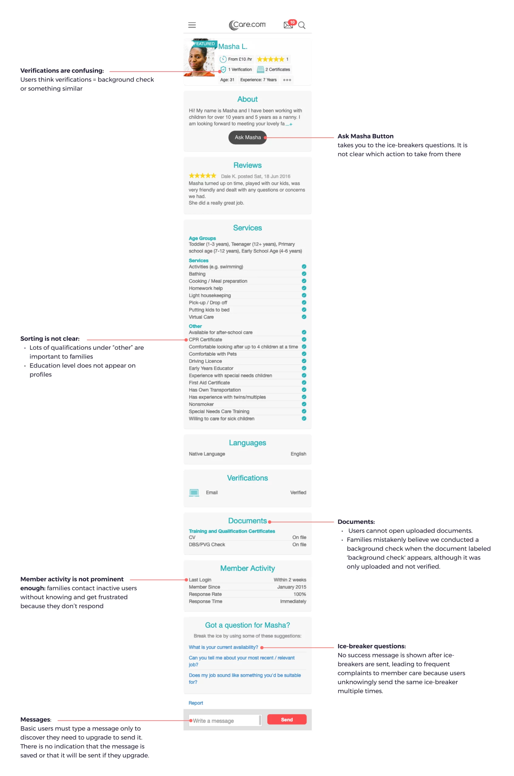
The image below illustrates the problems we identified on the profiles.
We also gathered the main pain points in the following list.
User pain points:
- The structure is confusing, making it hard to find the right information at first glance:
Important information for families is often placed at the bottom of the page or under the “Other” category. - The current trust features (badges, icons) are misleading: Some users mistakenly believed that the ‘verified’ badge meant that Care conducted a background check on the provider, when in fact, they only verified the validity of the phone number or email address
- Many care providers don’t respond to messages because many of the displayed profiles are inactive, and this information can only be found at the bottom of the page.
- Ice-breaker questions are misleading because basic users are directed to a paywall after clicking on one, without prior notice that payment is required to contact caregivers. Additionally, the lack of confirmation that the question has been sent causes users to repeatedly send the same question to a caregiver.
- The current UI of this page looks old, not attractive and doesn’t match the rest of the platforms, which looks suspicious
In the meantime, we looked into data with our business analyst to understand how the profile pages were performing.
Business problems:
- Only 46% of all the members on the platform are matching
- Only 12,4% of Families or Seeker upgrade to a premium plan from the provider profiles
- The page is not aligned to the current Brand style
Definition
To align on goals and find solutions to the user and business problems we had previously identified, our team gathered for a workshop using the Lean Canvas method.
We decided to first focus on the UK, Canada and Germany—our largest markets—as well as on Childcare and Housekeeping, our primary verticals.
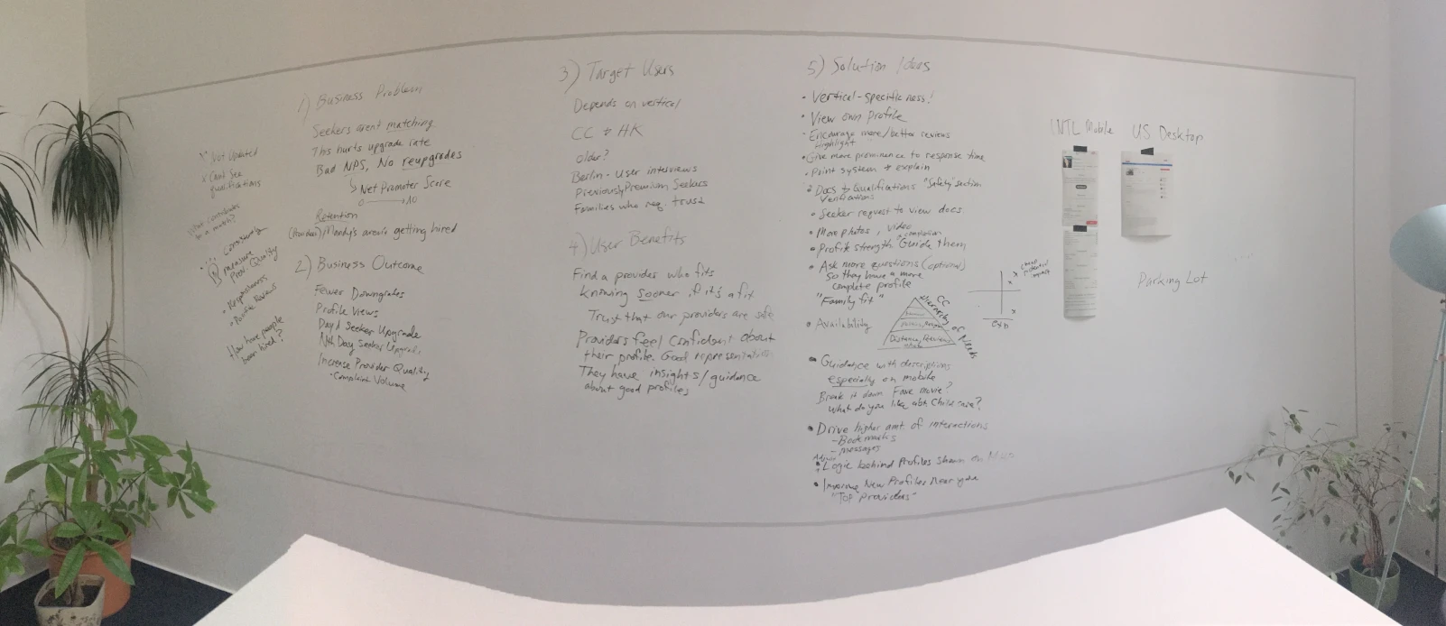
We used an Effort vs. Impact decision matrix to select the best ideas that would have the highest impact and require the least effort from the software engineering team, helping us determine which solutions to implement.
We divided the project into three milestones to limit the scope for engineers and outlined the ideas we wanted to implement in each milestone. In this case study, we will focus exclusively on Milestone 1.
Milestone 1
Enhance the UX & UI of member-facing provider profile pages for all verticale.
- Make profiles vertical-specific: Tailor profiles to specific verticals for better relevance.
- Reorganize content architecture: Prioritize and display the most relevant information first.
- Highlight information based on preferences: Display information according to the preferences entered by families.
- Improve the ice-breaker and messaging experience: Increase transparency about the need to upgrade to premium for messaging, and enhance the overall messaging experience.
- Adapt the page’s UI to align with the new design system.
Milestone 2
Add new features and improve the UX on the member side
- Improve the current profile ranking system by adding new criteria such as responsiveness, reviews, etc.
- Enhance the review experience: Improve the process to encourage more families to leave reviews.
- Give more prominence to photos and the possibility to upload introduction videos
- Add an availability feature.
- Safety & trust features.
- Drive higher amount of interactions (bookmarks, messages sent)
Milestone 3
Apply the pattern library and UX changes to provider profiles in the visitor experience.
User Research
To redefine the page architecture, we asked our users to identify the most important information they seek on a provider profile, starting with childcare.
We sent a survey to our pool of testers to gather quantitative data and complemented these findings with qualitative insights from nine unmoderated user tests and five remote user interviews.
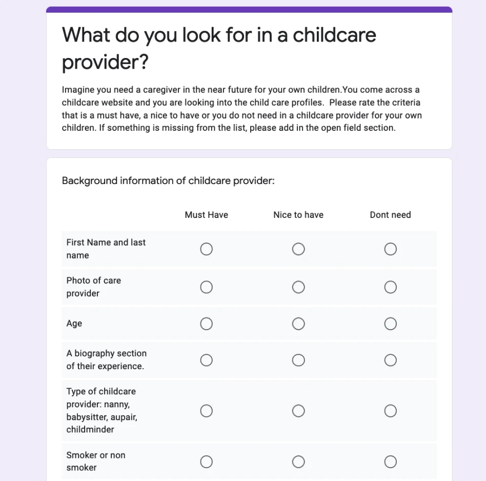
The top three pieces of information parents were looking for were:
- Background check
- Photo
- Biography (About Me section)
We then began prioritising each piece of information based on its importance to parents.
Prototyping
1. Content Architecture
Since we plan to run A/B tests in the future to determine the best order for displaying information, we decided to break the profiles into separate modules to make this process easier.
The modules were shown as follows:
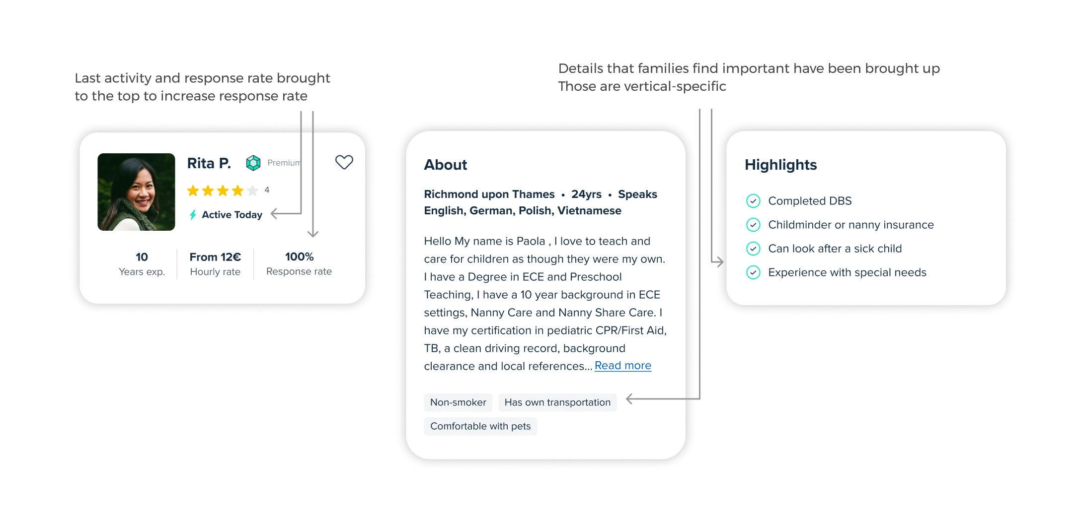
- Header: name, profile photo, premium badge, years of experience, response rate, last online and highlights on desktop.
- About: biography, age, location, languages & labels such as non-smoker, comfortable with pets, own transport.
- Highlights: nanny insurance, looking after sick child, experience with special needs, completed DBS / PVG checks
- Experience: age groups
- Services
- Reviews
- Qualifications
The most important information, including last activity and responsiveness, has been moved to the top of the page to help families avoid contacting inactive members.
We utilised the About section and Highlights to showcase key criteria that parents look for in a caregiver, such as “non-smoker” and “experience with special needs.”
2. Ice-breakers
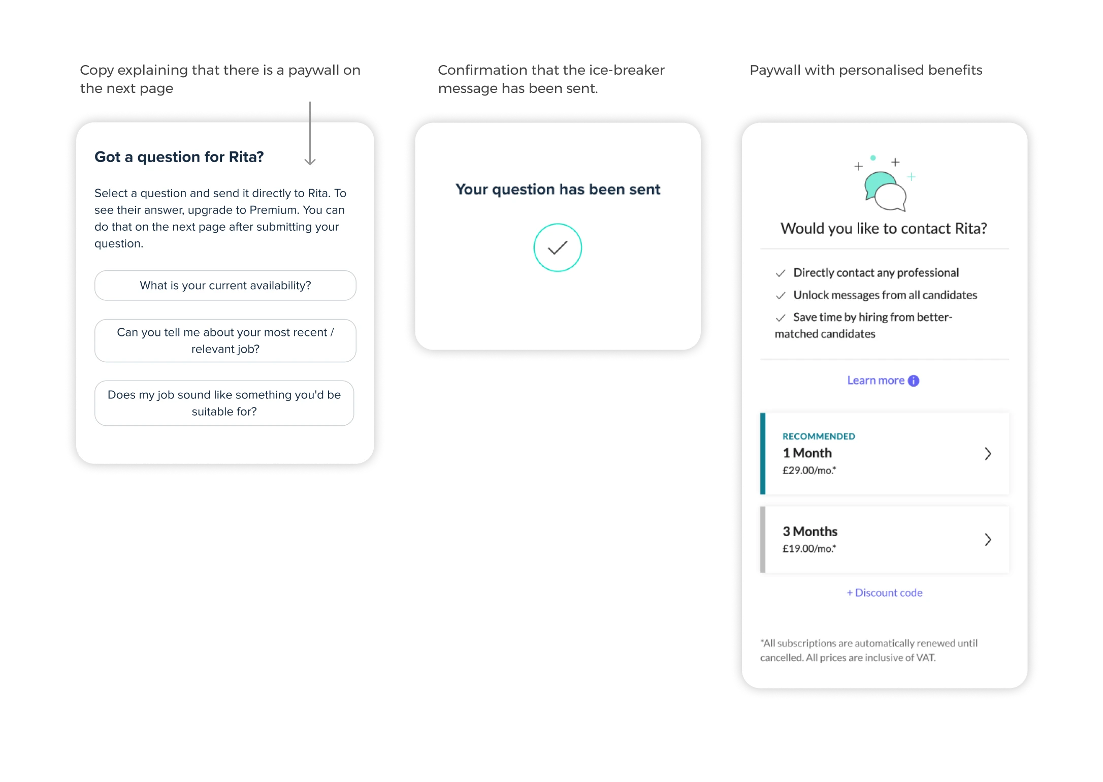
In the new experience, we redesigned the ice-breaker questions to appear as buttons with a hover effect, indicating they are clickable. When users click on an ice-breaker question, they now receive a confirmation that the question has been sent, and are informed via updated copy that they will be redirected to a paywall.
3. Messaging experience
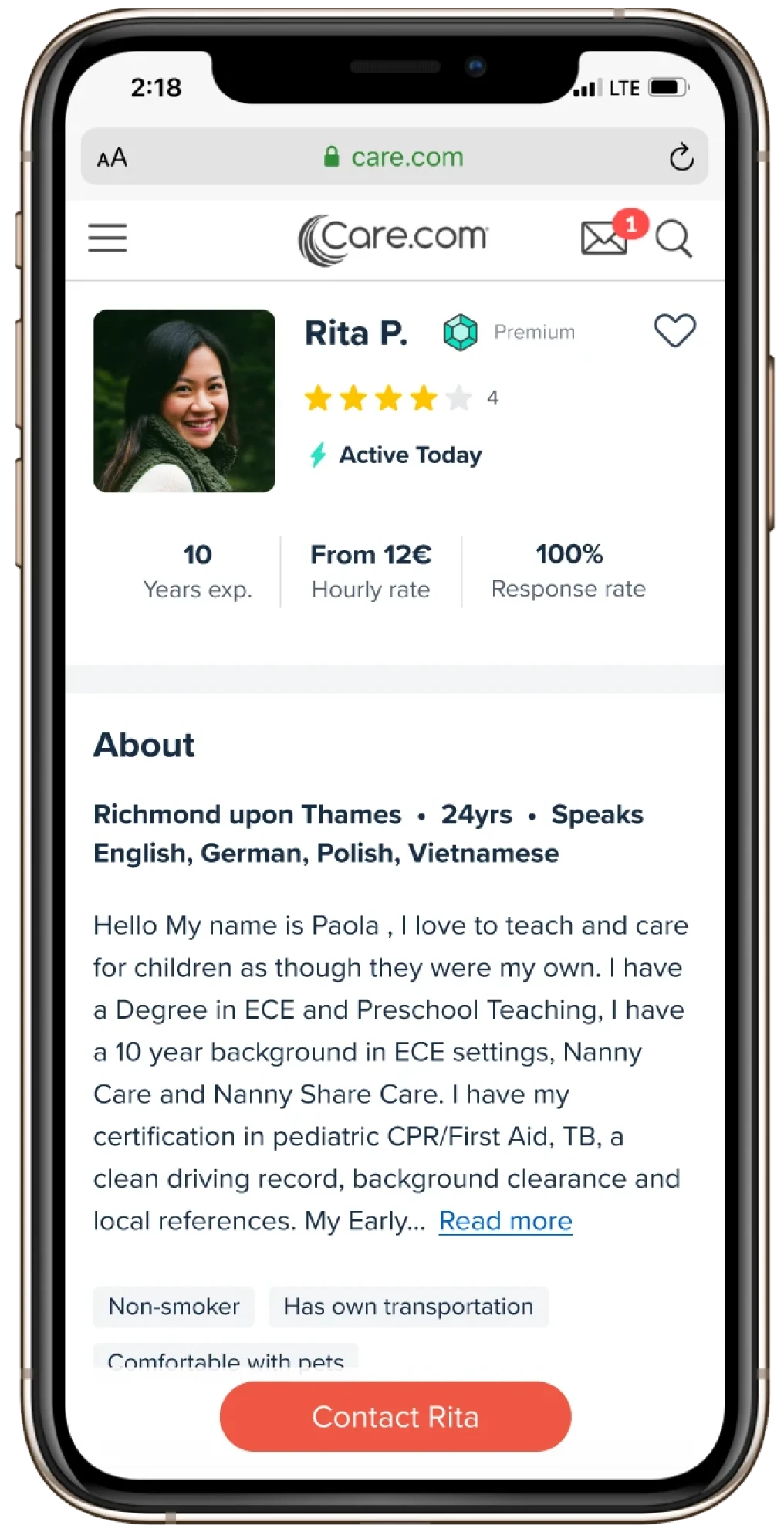
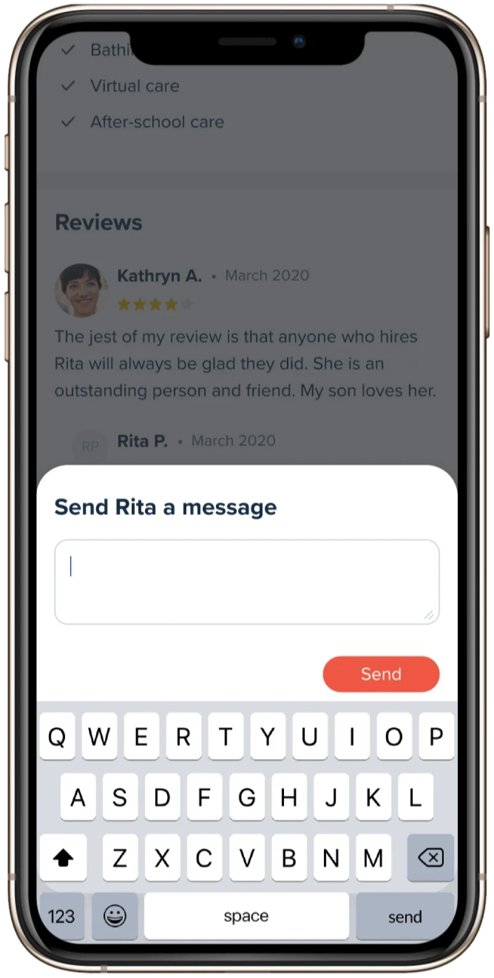
On mobile, the contact button opens an overlay for premium users to compose a message directly, rather than being sent to the mailbox as on the desktop version. This allows users to send messages and continue browsing seamlessly.
For basic users, we tested changes to the call-to-action text, such as “Upgrade to contact {provider’s name}”, and removed the option to compose a message before being directed to the upgrade page, in an effort to be more transparent.
While this test improved the user experience, it resulted in a decrease in conversions. Therefore, for the MVP, we reverted to the previous flow: “Contact {provider’s name}”, followed by the message box, and then the paywall. We plan to test other options in the future.
4. Other verticals
Once we had a working prototype, we began exploring other verticals and adapted the profiles accordingly. The most challenging vertical was special needs, as the required information varied depending on the specific disabilities for which families were seeking assistance.
We also considered adding an option for users to navigate between profiles if a provider offered services in multiple verticals, such as childcare and housekeeping or pet care and senior care. However, this feature required further consideration and was out of scope, so we decided to revisit it in Milestone 2.
Challenges
One of the major challenges in this project was that we initially outsourced front-end engineering to an external team, which led to quality issues early on. As a result, leadership decided to switch to a different company, requiring us to onboard a new team in the middle of the project.
Additionally, our senior Product Manager was laid off during the project, and we had to bring a junior PM up to speed quickly.
This project was also the first to use our new design system, which was still undergoing changes as engineers were implementing the designs. This caused a significant amount of frustration.
Despite these challenges, the project became an opportunity for growth, and the redesign ultimately had a positive impact on the business.
Impact
Since launching the new provider profile pages we have seen an increase of unique profile view and conversion rate from the profile pages and a decrease of messages sent from profiles which was positive as it meant less “ice-breaker” questions had been unintentionally sent.
Profile page views
+24%
Upgrades
+18%
from profile pages
Messages sent
-67%
from profile pages