The Product
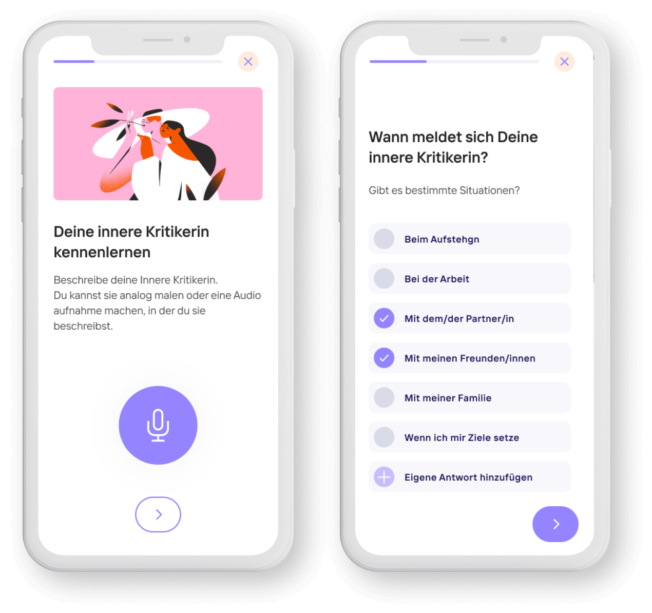
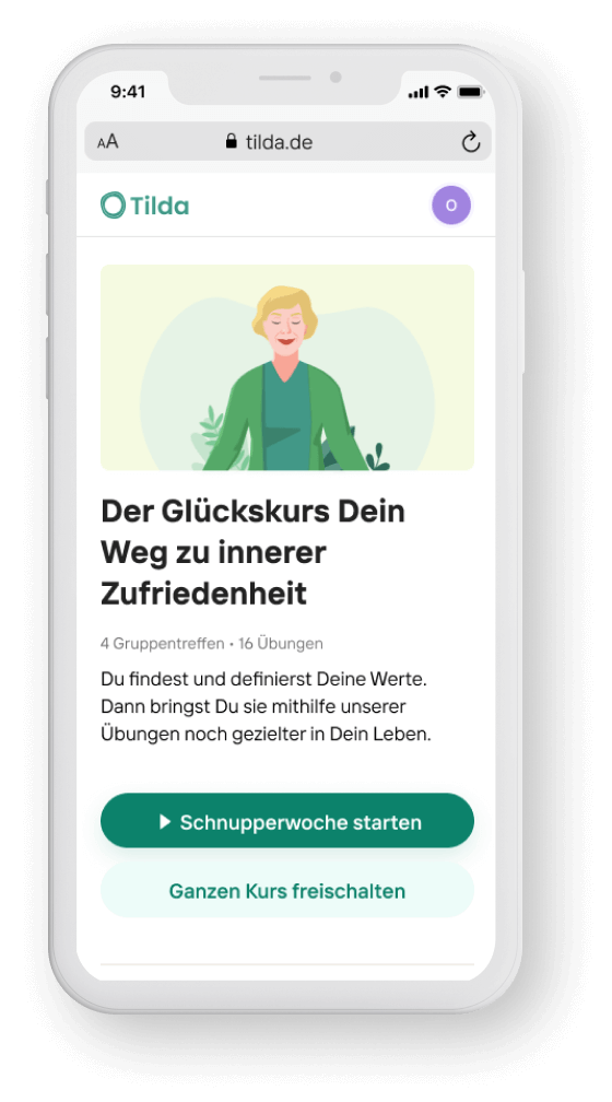
Tilda offers a set of online mental health support programmes specifically tailored for women over 40. It aims to empower them to cultivate inner satisfaction and develop strategies to effectively manage light to mild depression symptoms in their daily lives and prevent severe depression.
Project Context
The company, initially an early-stage startup incubated by BCG Ventures in collaboration with a major German media group, introduced its first product—a web-based course employing cognitive behavioral techniques (CBT) to aid women over 40 in improve their mental well-being.
Additionally, another product targeting women experiencing depression was in development, aimed at becoming a DiGA course.
Goal
This case study tells the story of this design sprint workshop and its outcomes
Roles and responsibilities
4 people were involved in this project:
- 1 Product Manager
- 1 Senior Software Engineer
- 1 Senior Product Designer (me)
- 1 Psychologist
I led the product design and user experience on this project.
Design Sprint
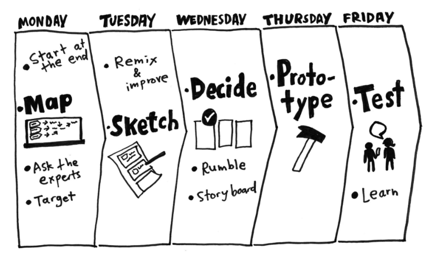
1. Discovery
We collected qualitative and quantitative feedback beforehand, based on:
- User interviews
- User feedback module that appears after each exercise in the web-app (database)
- Usage data (Mixpanel und Hotjar)
- User metrics (Mixpanel)
- Experts interviews (Interviews with our experts at Tilda)
User Pain Points
The most common problems based on the feedback we collected about the web-app were the following ones:
- Users forgot to use the program regularly despite regular reminders sent by email
- Users have to log in every time and forget their password
- Users find it hard to apply the concepts learnt in the course and exercises to their daily routine
- The content doesn’t always match the users’ personal life story, which upsets them.
Business Problems
- Low customer retention
- High competition
- Low flexibility within the program
2. Definition
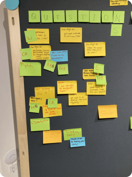
How Might We Questions
After presenting the user problems and business problems we reframed them into how might we questions :
- How might we create a habit for mental well-action?
- How might we personalise the experience to support habit creation / increase product retention?
- How might we enable non-linearity / increase flexibility to support habit creation?
3. Ideation
Idea sketching
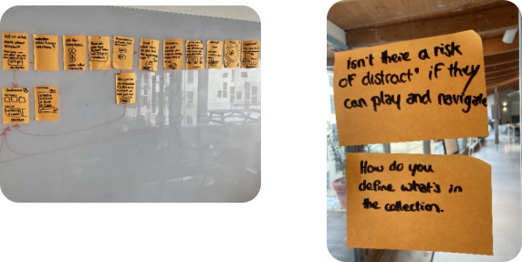
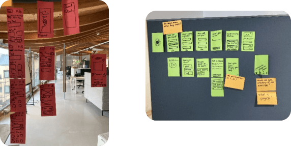
Each participant sketched a user flow according to the agreed upon ‘How Might We’ questions, and then we voted for the best ideas
4. Wireframes / lo-fi Prototype
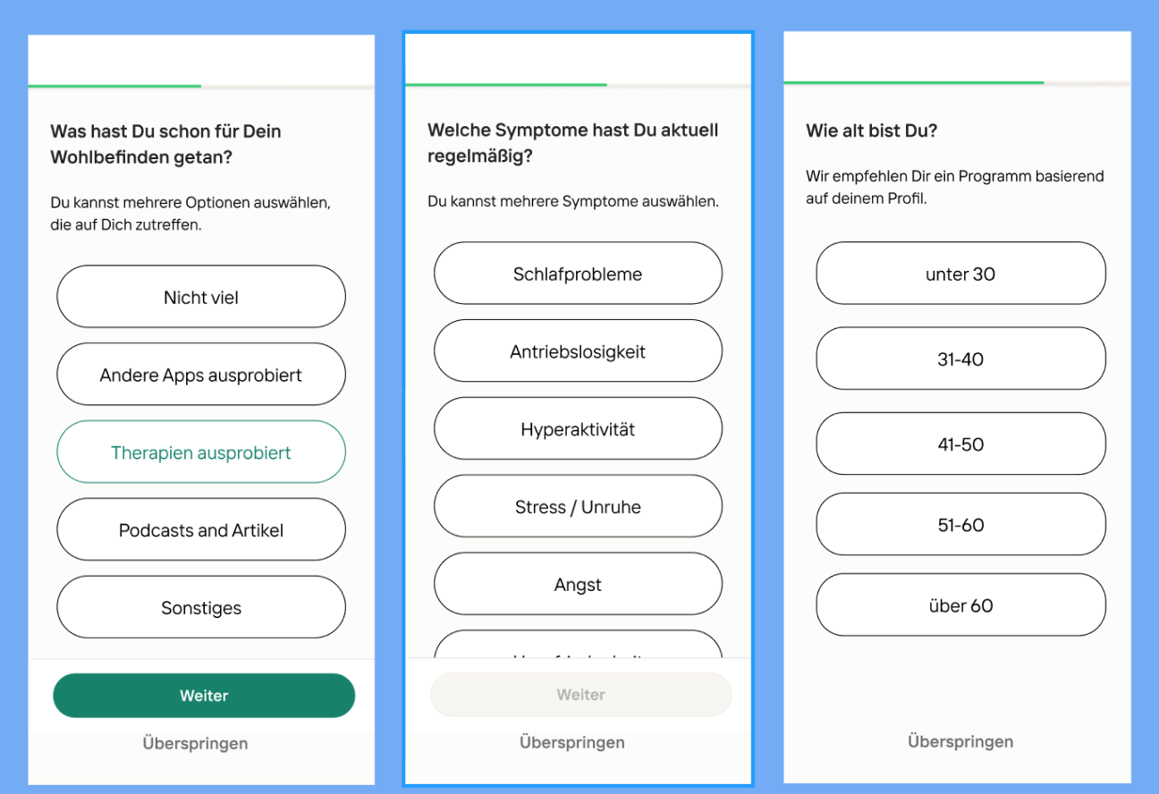
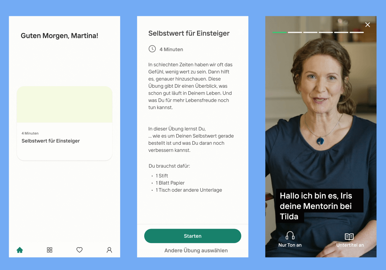
Based on various ideas and discussions sparked during the ideation workshop, we created wireframes for the envisioned new app.
The idea was to reduce options offered to the user to reduce the risk of choice paralysis.
5. Metrics
To measure success, we decided to base ourselves on the following metrics:
Primary Goals
- Increase customer retention (compared to the web app)
- Reduce drop-off rate
- Increase NPS (net promoter score)
- Increase number of completed activities
Secondary metrics
- Reduce symptoms (measured with the help of a PHQ9 Questionnaire)
- Increase user engagement and time of use
Outcomes
The project was suddenly terminated due to the investors’ decision to discontinue with Tilda.
