Case study

Turning symptom data into therapeutic insight

Designing the Symptom Statistics feature for a menopause support app that became a prescribable digital therapeutic in 2026, in close collaboration with the team’s clinical scientists.

Screen of the statistics feature

Role

Product Designer

Team

Head of Product, Tech Lead, Science team, Illustrator, Engineering

Timeline

October 2024 – ongoing

Product

Menopause companion app, certified as a prescribable digital therapeutic in 2026

Context

An in-house team, built from scratch

When I joined in October 2024, the product was mid-transition: an external agency had owned design, product, and development up to that point, and the company was bringing it all in-house. A Head of Product and a Tech Lead had just joined; there was no dedicated designer yet.

My first weeks went into auditing the screens already live, pulling out the patterns that worked, and formalizing them into a small design system.

That audit also surfaced components that weren’t accessible, which mattered more here than usual since this app would eventually be prescribed as a medical device. Remediation became an ongoing thread, not a one-time fix, and got more urgent later when the app went through certification review to become a DiGA, Germany’s listing for prescribable digital health apps. I rebuilt what I could, and found workarounds for what I couldn’t rebuild in full.

The problem

My first feature ownership was Symptom Statistics: the part of the app that helps patients track their symptoms and recognize the situations in which they occur.

The initial scope covered three tracked symptoms: hot flashes, emotional stress, and sleep. This case study focuses mainly on hot flashes.

The challenge wasn’t primarily visual. The Science team needed these statistics to do two things simultaneously:

  • Apply CBT (Cognitive Behavioral Therapy) principles, surfacing the contexts in which symptoms were strongest, and which coping strategies actually reduced them.
  • Show symptom evolution over time, so patients could see measurable improvement.

Symptom Statistics has stayed a core module ever since, inside the product that later ran the clinical trial covered under Outcome.

Starting point

Starting from an existing tracker

Before designing any statistics, I had to understand what was already being tracked, since the module couldn’t measure anything patients weren’t logging. The three entry screens below were built before I joined, and they set both the ceiling and the floor of what statistics could compute.

Each entry mixes multi-select and single-select context (location, people present), 0–10 severity sliders, and for hot flashes, a list of coping strategies with a “did this help?” follow-up. Sleep also asks about sleeping habits and insomnia, plus strategies for falling asleep.

Symptom tracker for hot flashes in the app
Hot flashes: the entry form.
Symptom tracker for stress
Emotional stress: the entry form.

Process

Working with the Science team

I spent the early weeks embedded with the Science team, learning the data model and the therapeutic intent behind it. This wasn’t a UI problem I could solve alone: it meant translating clinical logic into something a patient could use daily, with no medical training.

Defining the taxonomy

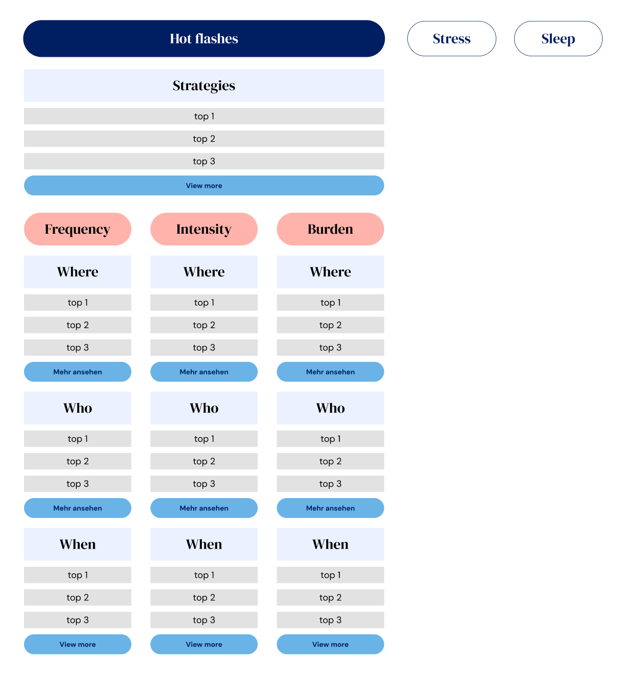
Together we mapped out which categories mattered most to a patient trying to understand her own symptoms: who was present, where she was, what time of day, and which situations helped versus made things worse.

Reduction strategies, the coping techniques that measurably helped, came out as the highest priority, since it’s the most directly actionable thing a patient can act on. 

That set the taxonomy: Strategies as its own top-level category, with Where / Who / When broken out separately for each symptom.

The taxonomy that shaped everything downstream: Strategies as its own top-level category, and Where / Who / When broken down separately for each of the three filters.

Guarding against misreading the data

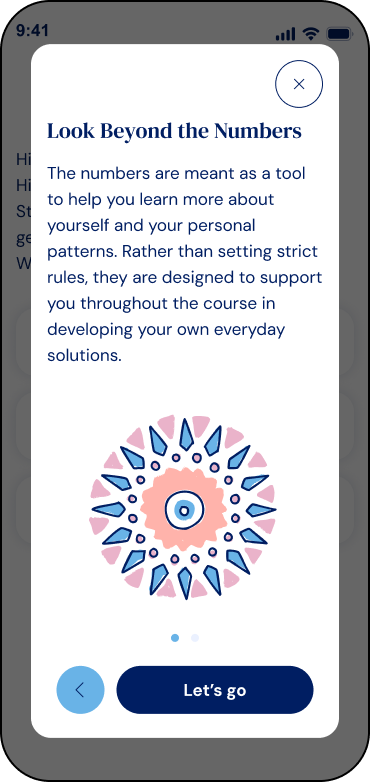
One of the more delicate decisions was adding a disclaimer around situational correlations. Raw pattern data is easy to misread: a patient whose hot flashes spike whenever her manager is in the room could wrongly conclude she needs to quit her job, when the real driver might be stress that’s manageable another way.

We added a screen at the entry point of Statistics, shown the first time a patient opens it, explaining how to interpret the data before she sees a single number.

Disclaimer screen on how to interpret data showed in the statistics
Intro screen shown the first time a patient opens Statistics, setting expectations before she sees a single number.

Structuring the symptom parameters

Reviewing the existing symptom tracker, we found that each symptom needed its own data structure. The parameters that mattered for hot flashes weren’t the same ones that mattered for emotional stress:

Symptom

Hot flashes

Emotional stress

Tracked Parameters

Frequency · Intensity · Discomfort

Feelings · Irritability · Anxiety · Depressed Mood

One detail we refined with the Science team: every 0-10 slider carries a qualitative label next to the number “8 – Severe,” “10 – Maximum,” “3 – Low.” A bare number is hard to feel; a word made it relatable, for patients and for the statistics screens reusing those values later.

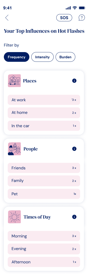
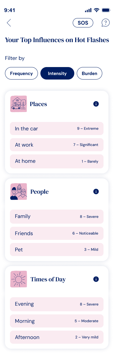
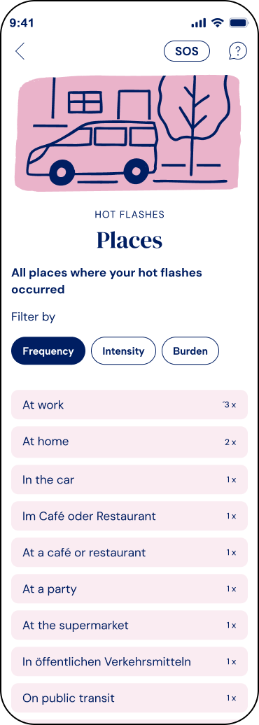
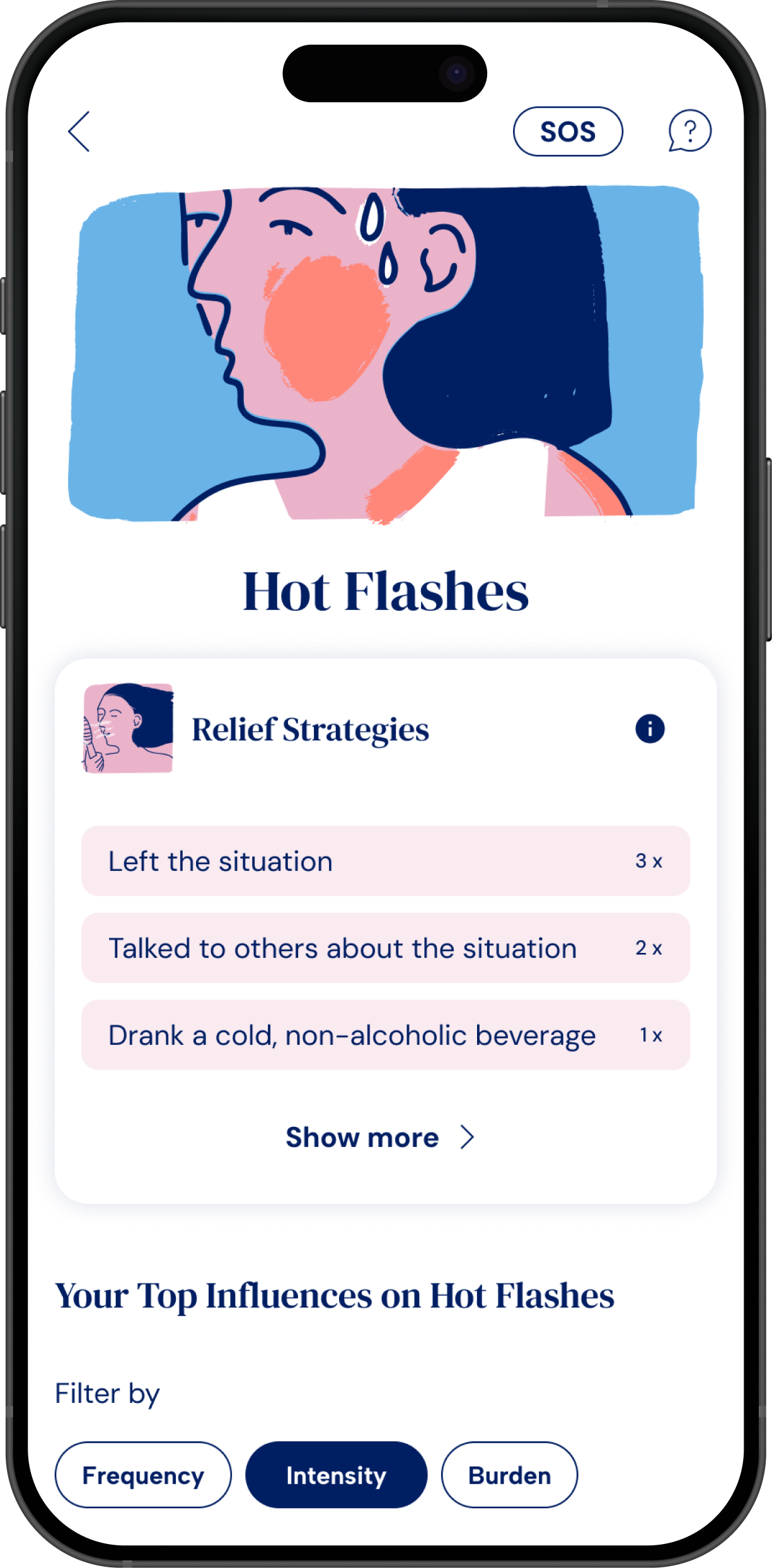
To handle up to four parameters per symptom without overwhelming the patient, I designed a pill filter defaulting to Frequency, so she could switch parameters without leaving the screen. Frequency counts how often an item, like “at work” or “in the car,” came up across her entries. Intensity averages the severity she logged each time. The two can disagree: “in the car” only came up once, so it loses on Frequency, but that one entry was rated 9, Extreme, so it wins on Intensity.

Frequency filter active: locations ranked by how often they came up.
Statistics Hot flahes Situations filtered by intensity
Intensity filter active: the ranking flips, "in the car" moves to first, because it's rare but severe.

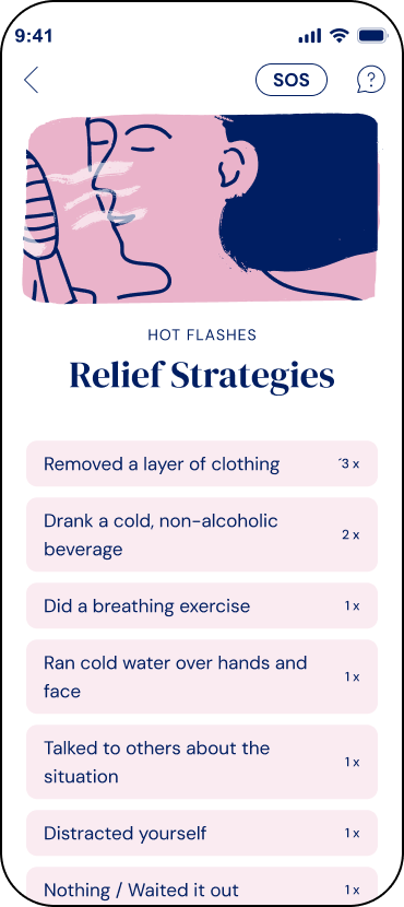
Both the Where/Who/Time breakdown and the Strategies list use the same pattern: a short preview of the top 3 on the main screen, with “view more” expanding to the full, re-sortable list. Strategies stays ranked by frequency throughout, since it isn’t tied to a severity scale the way locations or people are.


Expanded 'Places' subpage for hot flashes, reached via 'view more', listing every location ranked by frequency, with the same Frequency / Intensity / Burden filter pills repeated at the top so the ranking can be changed without leaving the page
The "view more" subpage for locations, the filter pills carry over, so the full list can be re-sorted by Frequency, Intensity or Burden.
Strategies for relief, ranked by occurrence.

The visual system

To help patients tell symptoms apart at a glance, I assigned each one a distinct color, visible throughout the onboarding and home screens above, then worked with the team’s illustrator to produce:

  • A banner illustration for the top of each statistics screen, representing the symptom in focus
  • A smaller square format for the symptom-selection screen
  • A set of “illucons”:  icon/illustration hybrids, part icon, part illustration  for each parameter, so the parameter list would feel inviting to browse rather than reading like a plain settings menu

Design proposals were mine to drive, but the decisions that mattered most:  taxonomy priority, disclaimer wording and placement, parameter structure,  were made jointly with the Head of Product and the Science team, with the Tech Lead brought in wherever a choice carried real technical trade-offs.

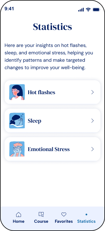
Statistics selection screen with illustrations for each symptom
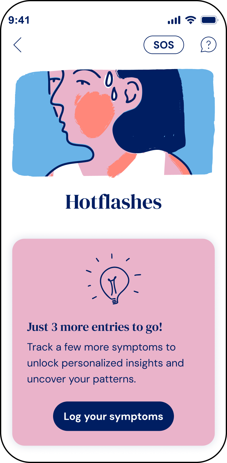
Empty state screen on the statistics screen

Balancing scope and delight

A recurring tension throughout this project was keeping scope as small as possible while still shipping something patients would actually want to keep using. Symptom statistics only work if patients keep logging  so the module had to earn repeated use, not just present data correctly.

Most of the delight came from choices that added little technical scope: the illustrated banners and illucons, the ranked Relief Strategies card, framing the empty state as an invitation, “soon you’ll be able to learn more about yourself,” instead of an error state. None of it needed new data. It just changed how the existing data felt to look at.

Iteration

Visualizing progress over time

Symptoms-over-time was cut from the MVP. We focused on triggers and relief strategies first, to hit the ship date tied to the clinical study and keep the CBT approach front and center. A trend graph wasn’t essential to what the study measured, and clinicians already had their own way to track evolution internally.

It came back once the MVP shipped: user testing and the clinical study both surfaced the same gap, and retention gave a second reason to prioritize it, since seeing visible progress keeps patients logging.

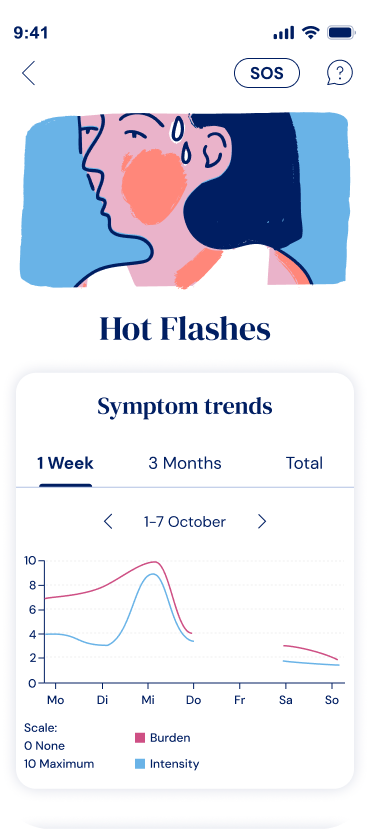
I designed a second iteration end of 2025: a trend graph with three time ranges. My first proposal was week / month / 3 months, but the Head of Product flagged that patients on extended prescriptions use the app for six months to a year and would want their whole journey at once. So we landed on week / 3 months / total.

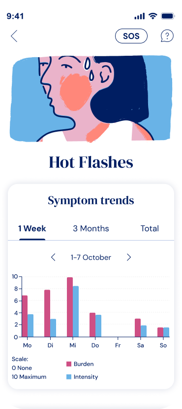
I’d initially pushed for a bar chart on the weekly view for clearer daily values, with a line chart for the longer ranges. The team preferred one reusable chart type to keep dev effort down. We chose the line chart: it held up over longer durations and stayed legible even at the weekly view. Implemented Summer 2026.

Symptoms over time graph version 2

Outcome

Clinical efficacy is measured at the product level, not per feature, so these numbers describe the app as a whole, not Symptom Statistics alone.

The trial ran with 100 participants over 12 weeks, in partnership with an academic medical center, and was published in a peer-reviewed journal in late 2026.

 
  • 71% reached a clinically relevant improvement
  • 53% fewer menopause symptoms overall
  • 42% less burden from hot flashes and night sweats
  • 94% completed the full study
  • 0 serious side effects reported


Lessons learned

Working this closely with a Science team meant the therapeutic logic was solid from day one. But most of what I knew about patients came secondhand, through the team’s clinical expertise, not from talking to them myself. I wish I’d had a way to sit down with a few directly and hear what they actually needed.

The bigger gap was that we didn’t test before we shipped. The taxonomy, the disclaimer, the frequency-versus-intensity model, all reasoned through with the Science team and the Head of Product, none of it tested with a real patient before the trial started. We didn’t have time for a usability round, so we shipped on our reasoning and waited to see if it held. It did, but honestly that felt more like a risk that paid off than something we’d validated.

Next time I’d want a step back before launch: sit with a handful of patients, see if they land on the read we intended, catch what made sense to clinicians but wouldn’t to someone using the app alone at home. That matters more here, since a mistake in a medical device isn’t just a bad UX moment.