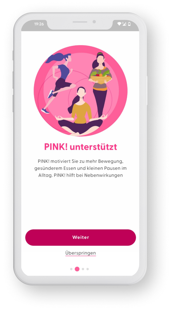
The App
The PINK! Coach app aims to support women with breast cancer in their daily life by helping them develop healthier habits to reduce symptoms and the risk of recurrence.
The app offers educational content and daily challenges around sports, nutrition and mindfulness, as well as additional features such as a community to connect with other patients, a secure e-wallet to store health-related documents, and an online appointment calendar.
Project Context
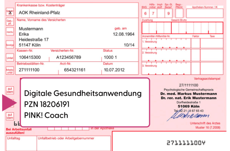
At the start of the project, the app had just been certified by the Bfarm (German Federal Institute for Drugs and Medical Devices) as a DiGA (Digitale Gesundheitsanwendungen or Digital Health Application) for one year.
This means that the application could be prescribed by doctors and its costs were covered by health insurance.
One of the constraints imposed by the Bfarm was that doctors could prescribe it only for three months, and a new prescription was required to continue using the app after this period.
This business model means that we needed to ensure that patients use the app regularly during these first 3 months and want to renew their prescription after this period.
As part of the DiGA certification, PINK! had one year to prove the effectiveness of its product on patients through a clinical study. This clinical study was scheduled for October 2022. To ensure the sustainability of the company, this clinical study had to be successful and prove that patients saw an improvement in their health during 3 to 6 months of use.
Goal
Before starting the project, numbers showed that 50% of users stopped using the application after 8 weeks. Therefore, it was necessary to investigate this retention problem and understand how we could convince users to continue using the application for at least 3 months.
Increase retention during the first three months of using the PINK! Coach app to be able to demonstrate its effectiveness in a clinical study.
Roles and responsibilities
Pink had 13 employees at the time.
The product team was composed of two people :
- 1 head of product
- 1 senior product designer (me)
I led the design and user experience on this project.
Software engineering was outsourced to a tech agency based in Hamburg, Germany.
We worked in agile environment and one-week sprints.
As a small team managing three distinct products – the application, an online course, and the website – at PINK!, resource allocation was prioritised based on project urgency.
Once the app became a DiGA for one year, by the end of June 2022, it became urgent to improve it for the clinical study. That’s why we only started working on this project in August for deployment by early October at the latest.
The process
1. Discovery & Definition
With tight deadlines, we didn’t have the opportunity to schedule user interviews, so we began by gathering all the information we had on the app’s usage:
- Usage data
- Reports from user interviews conducted in December 2021.
- User feedback received by customer service.
Guided by user data and feedback, we identified the following user pain points:
- Redundant daily goals such as “drink 1L water”, or “walk 4000 steps”, creating a feeling of monotony potentially discouraging users to continue
- Personalised goals start repeating themselves after 3 weeks, leading to user disengagement.
- The educational content in the “Infothek” section is underutilised.
- Users perceive the application as lacking personalisation despite completing a comprehensive health questionnaire during sign-up.
- The target demographic, typically aged 50 to 75, struggles with app navigation and exploring all features.
- Users frequently experience fatigue, hindering prolonged screen engagement.
Original screens from the App prior to the redesign
2. Ideation
The head of Product and I started brainstorming together on features or add-on that could increase satisfaction, improve the usability and the overall user experience as well as solve the user problems we had identified.
We came with a list of ideas that we then prioritised based on their potential impact and the effort they require in terms of engineering
The ideas that we kept were the following ones:
- Change the way information is organised in the “infothek”
- Create a course-like experience for the mindfulness program
- Visually separate the standard goals (drink 1L water, walk 4500 steps, etc..) from the personalised goals
- Make the sport activity more prominent by adding it to the goals
- Personalise daily sportive goals by asking questions about physical health
- Integration of an online-tutorial for new-comers
3. Prototyping
Once we were aligned on the objectives and the improvements we wanted to add to the application, I began the prototyping phase.
As I was the first internal product designer and since this was my first project on the app, I had to start by implementing the current (control) designs of the app in the design tool Figma. The agency that had created the Minimum Viable Product did not provide us with all the designs and it was important to me that we kept the original version in the design files to track the application’s evolution over time and justify each change.
I also had to gradually establish a design system to facilitate long-term design and ensure all designs remained consistent and correct some accessibility issues, such as poor color-contrast.
Once these tasks were completed, I started working on the improvements we wanted to add to the app.
I used Figma to build the different flows and lo-fi design that I submitted to the head of product for feedback then I built the high-fidelity version and a handover file for developers.
From a limited color palette
to a more accessible and inclusive color palette
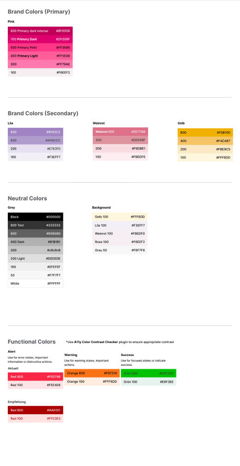
Change in Goal Layout
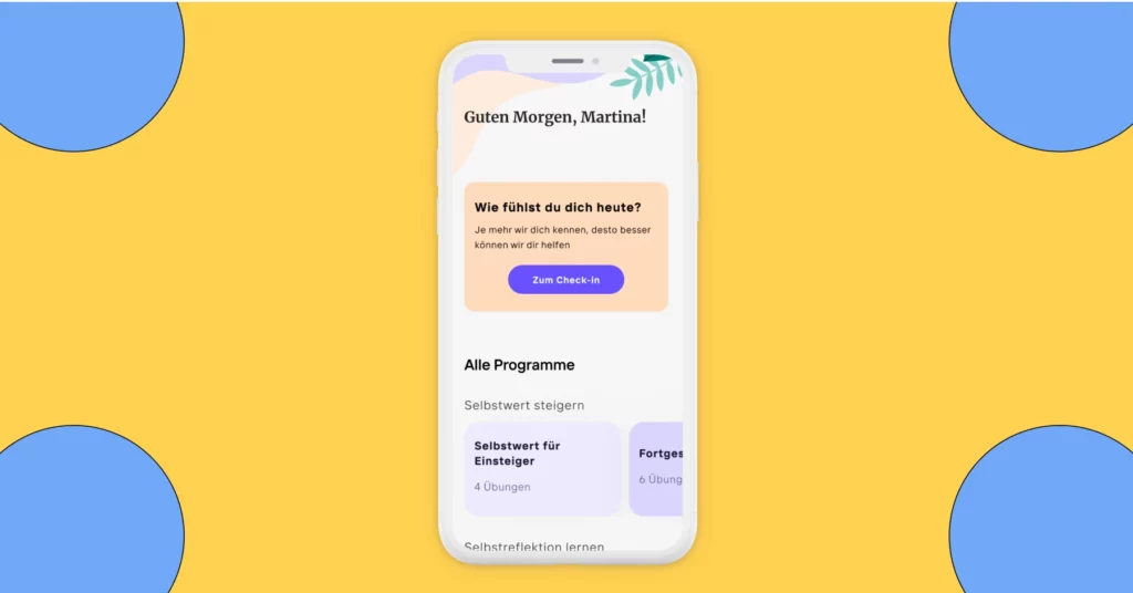
We have visually separated the personalised daily goals, which change every day, from those that need to be repeated daily, such as drinking water or walking 4000 steps. Although some users find these reminders irritating, we must keep them because they are important in the habit building process. By visually distinguishing them from the others, we hope that the personalised goals will stand out more and motivate users to log in every day to discover their new goal.
Adding Sports Activities to the Goals
For each sports activity entered into the application, the users earns points in the “movement” category, similar to when a goal is completed in this category. Therefore, it made sense to have this feature closer to the daily personalised goals and add purple on the side of the card to align it with the other goals that belong to the sports category
Old Version:
No distinction between different types of goals
New Version:
- “Standard goals” that always stay the same are visually separated from personalised daily goals that change every day
- Sport activities appear as part of the goals
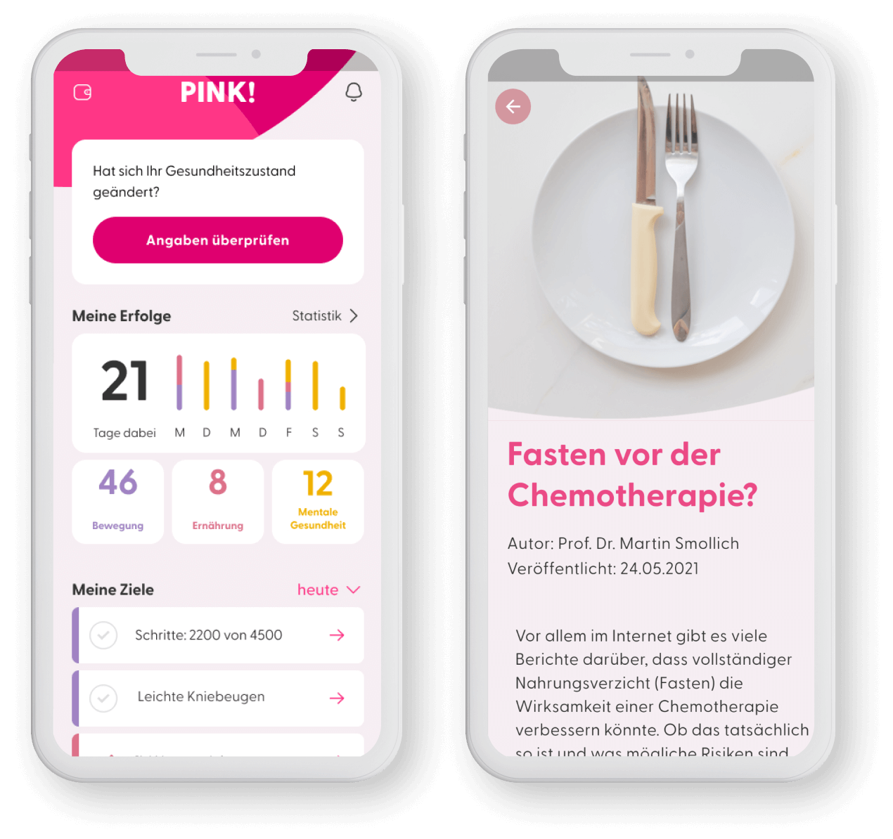
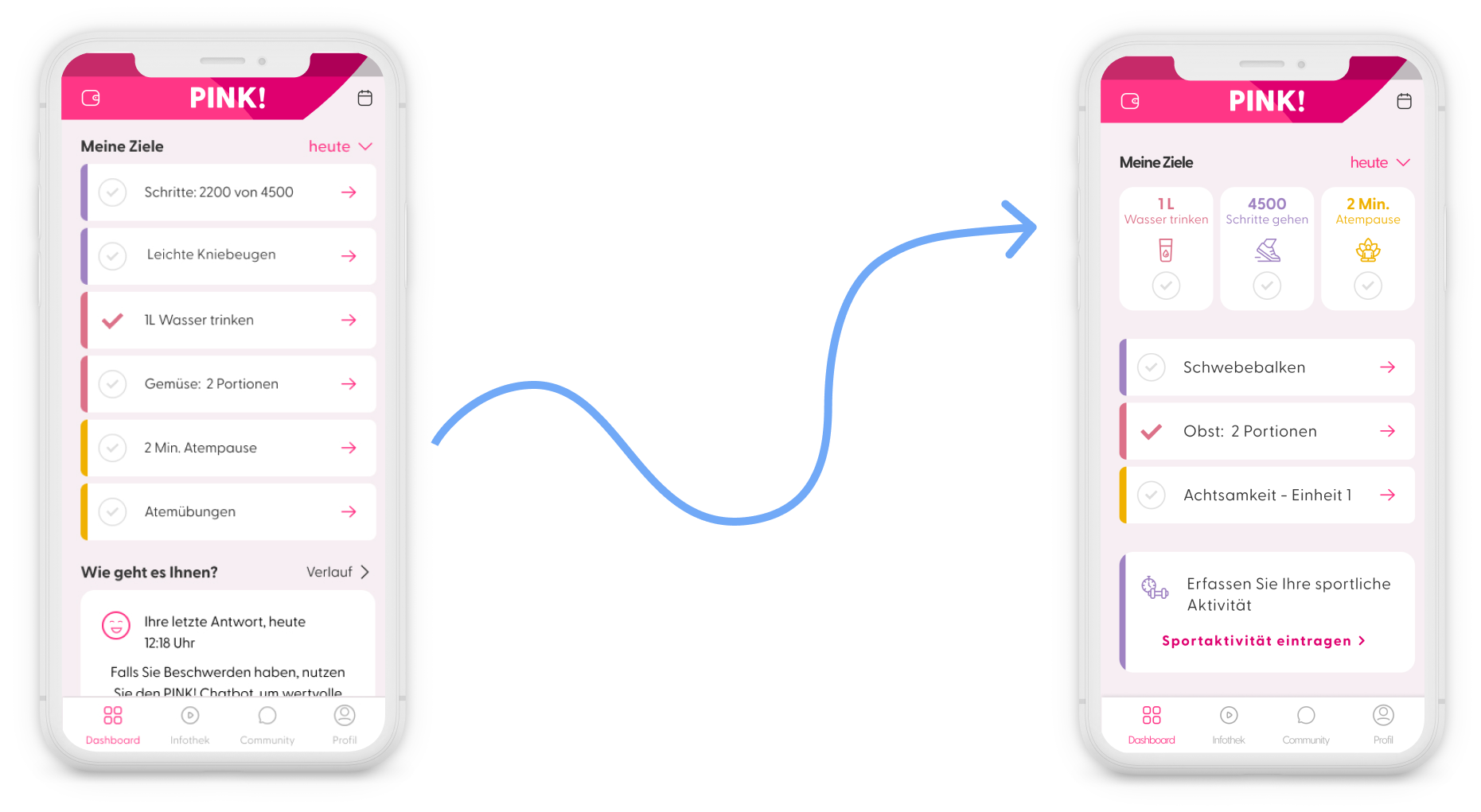
Change in Information Architecture and Visual Optimisation in the "Infothek"
The “infothek” contains a lot of important content around breast cancer written and curated by doctors that unfortunately wasn’t displayed prominently enough in the current version.
To improve the user experience, we :
- removed third level subcategories
- highlighted articles for each subcategories
- limited horizontal scrolling to 5 article-snippet per subcategory with the option to open a screen with all articles under this subcategory
- displayed all articles vertically, allowing users to see interesting articles at a glance.
- visually differentiated articles from other features, such as the mindfulness programme and recipes.
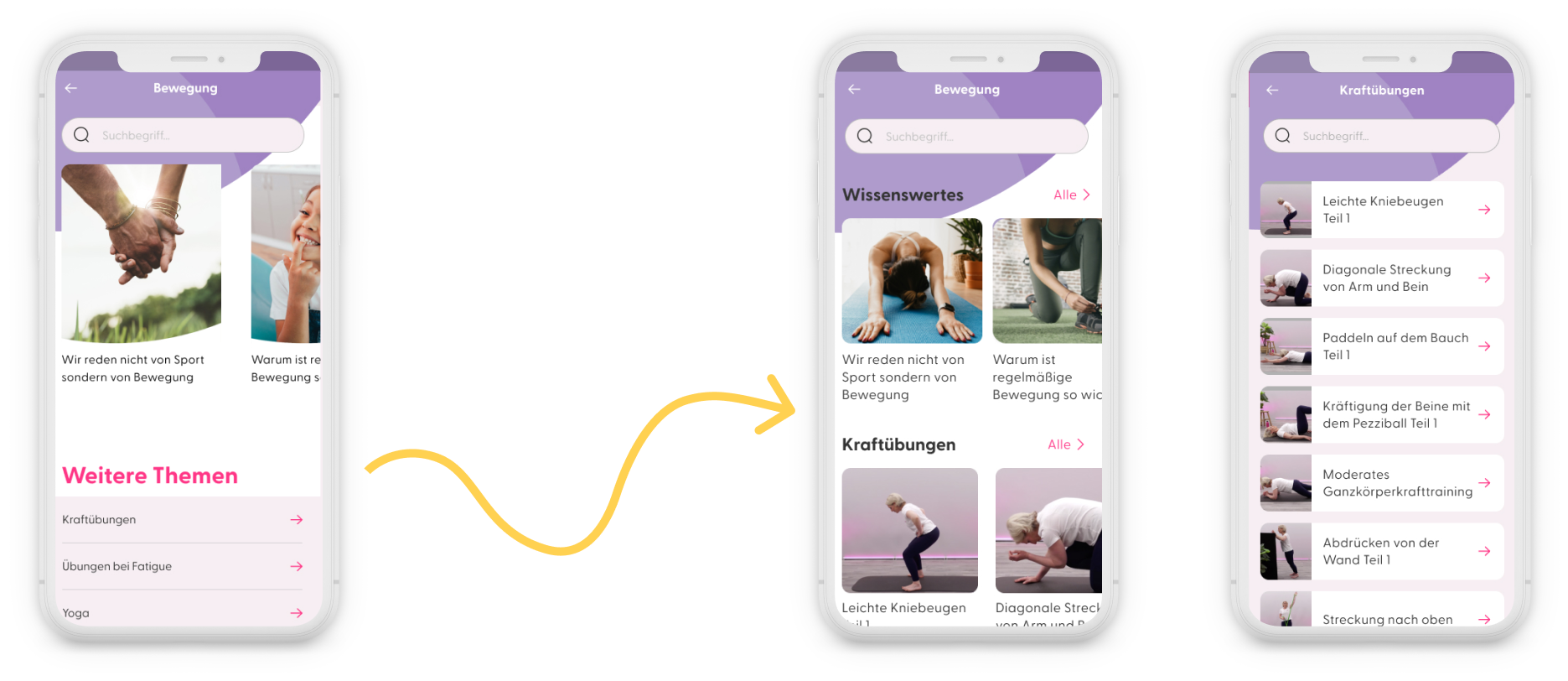
Regarding the mindfulness programme, we created a course-like experience. When users open it, all the course units appear. These units are initially locked and unlocked once the previous one is completed. This provides a better overview, and we hope it encourages users to engage with the course.
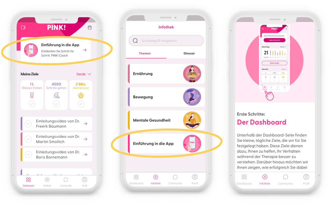
Introduction of an In-App Tutorial
There was no guidance within the app on how to use it. The only option for users was to download a PDF manual hidden in the “imprint” section of the app, which no one did.
The initial idea was to provide guidance through tooltips that would appear as users navigated the app for the first time, but this idea was technically too complex to implement at the time and beyond scope.
We then decided to create tutorial articles in the “Infothek” and add them to the daily goals for the first days of use to ensure these articles would be read.
We had to adapt this idea too, as we, in the meantime, had decided to limit daily personalised goals to the number of three to reduce the risks of cognitive overload. In the end we decided against having the tutorial articles appear as goals, because it would have hidden other goals that bring more value to users during the first week.
The final solution was to add a clickable card at the top of the dashboard screen to inform users about the tutorials and give them direct access to the articles during the first seven days. All the tutorial articles were accessible in the infothek under the category “tutorials” below the 3 main topics : movement, mindfulness and nutrition.
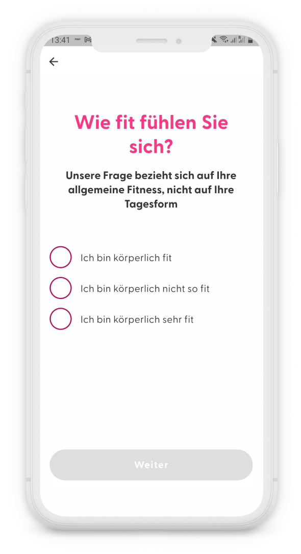
Inclusion of additional check-in questions
When the patient opens the app for the first time, she is required to answer a questionnaire about her health and her therapy status. Based on this information, daily challenges are generated. However, we have noticed that people’s needs vary depending on their athletic abilities, body, and personal goals.
Therefore, we have added additional questions about the users’ objectives to provide them with more personalised goals.
For example, if a user expresses a desire to reduce fatigue, they will receive targeted exercises aimed at this goal and will not have to manually search for these exercises in the app.
5. Validation
The designs were presented to the head of product, and together we reviewed each new feature.
We sought feedback from both the broader team, leadership and the software engineering agency.
We were unable to test the new version with users due to time constraints and took a risk by deploying a new version just before launching the clinical study.
Fortunately, everything went well for us.
As a product designer, I usually recommend testing designs before release, especially when the impact can be critical for the company.
Users over 50 tend to use applications and navigate the web differently from digital natives, and one of my challenges was to ensure that they could easily use the application. Particularly knowing that breast cancer patients often suffer from migraines or fatigue. It was a big challenge for me to launch new features without having tested it on this target group.
Outcomes
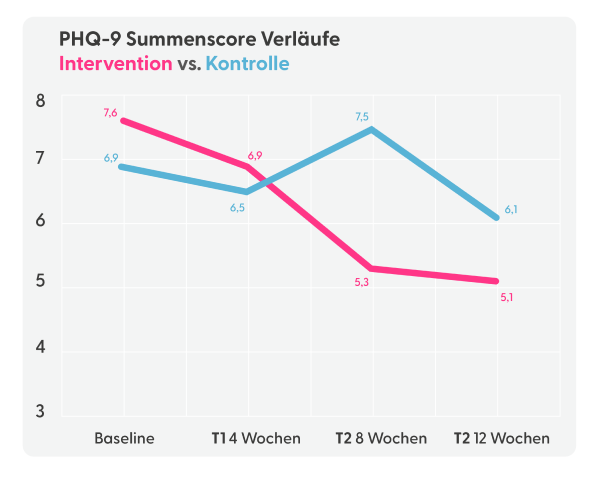
The clinical study was successful and was able to demonstrate that patients’ mental health improves over time using the application, and that BMI (Body Mass Index) stabilises or decreases over time.
The App Pink Coach has been listed permanently as a DiGA since November 2023
The overall app retention increased by 30% during the first 3 months.
The graph on the right side shows the decrease of depression symptoms over time when using the app. ”Kontrolle” in blue stands for control group, which means the group that didn’t use the app during the clinical study
The study showed us that the frequency of app use varies significantly according to age:
- 30% of users aged 61 to 70 used the application at least 7 days a week for more than 4 weeks, then dropped to 15% after 12 weeks.
- In contrast, patients aged 51 to 60 were 13% to use the application daily in the first 4 weeks, but this figure dropped to 5% after 12 weeks.