Case study

Turning symptom data into therapeutic insight

Designing the Symptom Statistics module for a menopause support app that became a prescribable digital therapeutic in 2026, in close collaboration with the team’s clinical scientists.
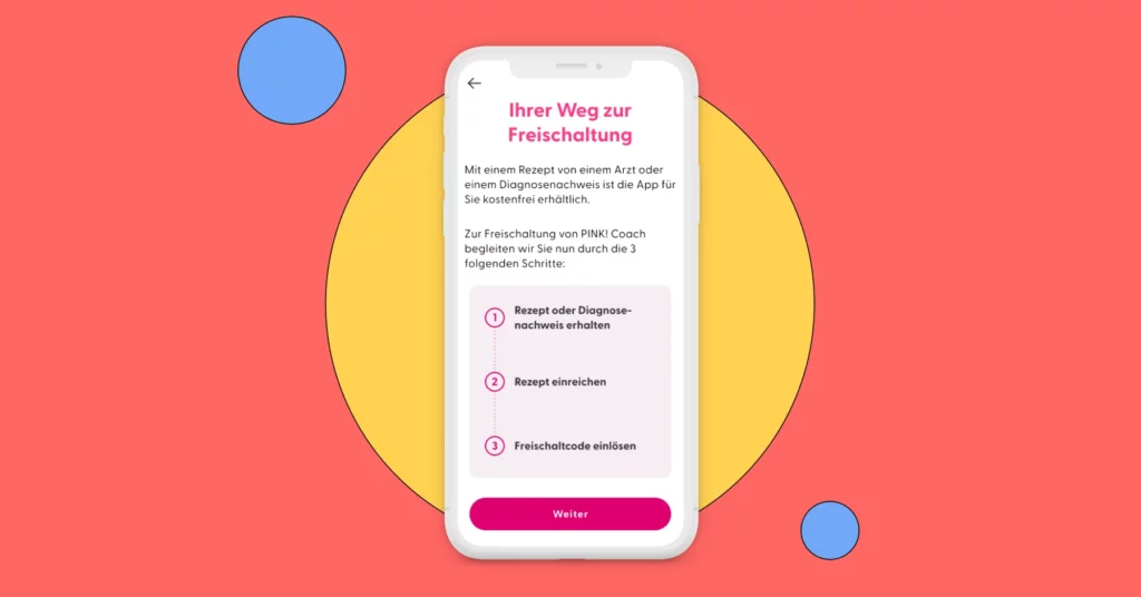
Pink Rezept Service Weg zur Freischaltung Gesetzlich-versichert

Role

Product Designer

Team

Head of Product, Tech Lead, Science team, Illustrator, Engineering

Timeline

October 2024 – ongoing

Product

Menopause companion app, certified as a prescribable digital therapeutic in 2026

Table of Contents

Context

An in-house team, built from scratch

When I joined the team in October 2024, the product was mid-transition: an external agency had until then owned design, product management and development, and the company was bringing all of it in-house. A Head of Product and a Tech Lead had just joined but there was no dedicated designer yet.

My first weeks went into absorbing the existing design language: auditing the screens already live, extracting the patterns that were working, and formalizing them into a small design system the team could build on consistently. Only once that foundation existed did I take ownership of new feature work

The problem

Data that has to do two jobs at once

My first feature ownership was Symptom Statistics: the part of the app that helps patients track their symptoms and recognize the situations in which they occur. The initial scope covered three tracked symptoms: hot flashes, emotional stress, and sleep.

The challenge wasn’t primarily visual. The Science team needed these statistics to do two things simultaneously:

  • Show symptom evolution over time, so patients could see measurable improvement.
  • Apply CBT (Cognitive Behavioral Therapy) principles, surfacing the contexts in which symptoms were strongest, and which coping strategies actually reduced them.

As a long-standing, core module of the app, Symptom Statistics has since sat inside the broader product that underwent clinical validation,  the trial behind its 2026 approval as a prescribable digital therapeutic, covered in full under Outcome.

Starting point

Starting from an existing tracker

Before designing any statistics, I had to understand what was actually being tracked — the module couldn’t measure anything patients weren’t already logging. The three data-entry screens below were built before I joined, and they effectively set the ceiling and floor of what statistics could compute.

Each entry mixes multi-select context (location, people present), 0–10 severity sliders, and for hot flashes and sleep, a list of coping strategies with a simple “did this help?” follow-up.

 
Symptom tracker for hot flashes in the app
Hot flashes: the entry form.
Symptom tracker for sleep
Sleep: the entry form.
Symptom tracker for stress
Emotional stress: the entry form.

Process

Working with the Science team

I spent the early weeks embedded with the medical/science team, understanding both the underlying data model and the therapeutic intent behind it. This wasn’t a UI problem to solve alone — it required translating clinical logic into an interaction model a patient could use daily, without any medical training.

Defining the taxonomy

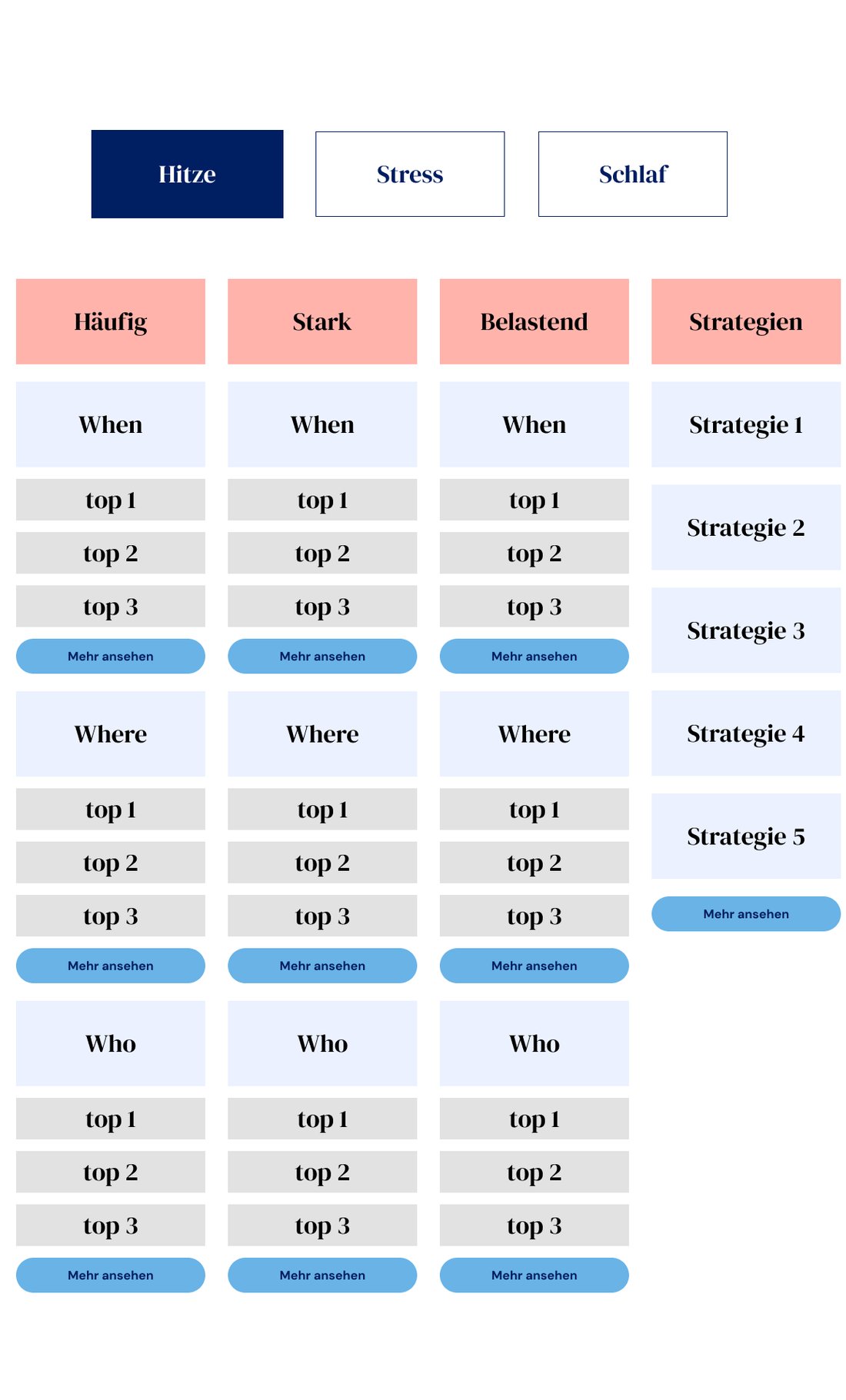
Together, we mapped out which contextual categories mattered most to a patient trying to understand her own symptoms: who was present, where she was, what time of day it was — and, critically, which situations helped versus which made things worse.

We prioritized these categories against the therapeutic goal. Reduction strategies,  the coping techniques that measurably helped, came out as the highest-priority category, since it’s the most directly actionable thing a patient can act on.

Taxonomy wireframes for the statistics feature
The taxonomy that shaped everything downstream: Strategies as its own top-level category, and Where / Who / When broken down separately for each of the three filters.

Guarding against misreading the data

One of the more delicate decisions was adding a disclaimer around situational correlations. Raw pattern data is easy to misread a patient whose hot flashes spike whenever her manager is in the room could wrongly conclude she needs to quit her job, when the actual driver might be stress that’s manageable through other means.

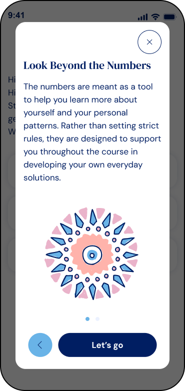
We introduced two screens at the entry point of the statistics space, shown the first time a patient opens it, explaining how the feature works and how to interpret the data before she sees a single number.

Disclaimer screen on how to interpret data showed in the statistics
The second of two intro screens shown the first time a patient opens Statistics, setting expectations before she sees a single number.

Structuring the symptom parameters

Reviewing the existing symptom tracker, we found that each symptom needed its own data structure. The parameters that mattered for hot flashes weren’t the same ones that mattered for emotional stress:

Symptom

Tracked Parameters

Hot flashes

Frequency · Intensity · Discomfort

Emotional stress

Feelings · Irritability · Anxiety · Depressed Mood

One detail we refined with the Science team: every 0–10 slider carries a qualitative label next to the number — “8 – Severe,” “10 – Maximum,” “3 – Low.” A bare number is hard to feel; pairing it with a word gave patients — and, later, the statistics screens reusing these values — something they could actually relate to.


To handle up to four parameters per symptom without overwhelming the patient, I designed a pill-based filter system defaulting to frequency, so she could switch between parameters without leaving the screen:

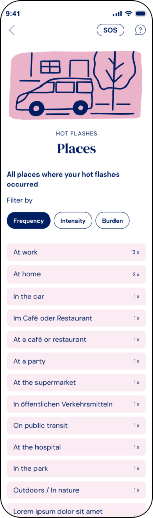
Hot flashes by frequency
Frequency filter active: locations ranked by how often they came up.
Hot flashes symptoms by intensity
Same screen, Intensity filter active: the ranking flips. "In the car" moves from least to most frequent shown, because it's rare but severe.

Frequency: the default view in that filter isn’t a field a patient fills in directly when tracking her symptoms.

We defined it as a count of occurrences: how many times a given item, like “at work” or “in the car,” was mentioned across her logged entries. The Where / Who / Time-of-day breakdowns above rank items by exactly that count by default, but that ranking basis isn’t fixed.

Switching the pill filter to Intensity or Burden re-sorts those same lists by that parameter instead: in the two screens above, “In the car” sits last under Frequency (1×) but jumps to first under Intensity (9 – Extreme), because it’s rare but severe.

“Top locations” can mean either “most frequent” or “most intense,” depending on what the patient wants to understand.

Both that breakdown and the Strategies list, below, followed the same display rule: the symptom screen itself only ever showed a short preview — the top few items — with a “view more” link expanding to the full list. For Where / Who / Time, the same filter pills reappear on that expanded subpage, so a patient can keep re-sorting the full list without going back. Strategies, by contrast, stays ranked by number of occurrences throughout, since it isn’t tied to a severity scale the way locations or people are.

The "view more" subpage for locations, the filter pills carry over, so the full list can be re-sorted by Frequency, Intensity or Burden.

Measuring success

Primary Metrics

To measure the success of this new feature, we should observe the following key metrics:

  1. Increase in redeemed activation codes:
    Track any increase in the number of activation codes redeemed over time.
  2. User engagement with prescription service:
    Track how many users use the in-app prescription service out of the total number of new app users who sign up after the feature launch and have not yet redeemed an activation code.
  3. Reduction in customer support inquiries:
    Assess any decrease in customer support inquiries related to obtaining activation codes or submitting prescriptions.
  4. Reduce drop-off rate:
    Decrease the number of users who stop using or delete the app after registration

Additional Metrics to Monitor

To continually refine our business strategy, enhance this feature, and improve our communication with health insurance providers, we will also monitor the following metrics:
  1. Time to code activation:
    Monitor the average time it takes for users to receive and activate their codes after submitting their prescription through the app.
  2. Successful prescription submissions:
    Measure the percentage of prescriptions or proof of diagnosis submitted through the app that result in users receiving an activation code or obtaining approval for cost coverage for privately insured users.
  3. Error rate:
    Measure the percentage of failed submissions or issues encountered during the prescription process.
  4. Drop-off:
    Analyse where users abandon the prescription submission process, helping to identify potential friction points.
  5. Health insurance provider engagement:
    Monitor the responsiveness and willingness of different health insurance providers to cooperate, identifying which providers are faster and more proactive in processing submissions.

Outcomes

The designs were handed over to the software engineers in October 2023. However, the feature was not launched until June 2024 due to a shift in priorities.

I had already left the company by the time of the launch and no longer have access to the database. For privacy reasons, this data cannot be shared with external parties.

It is still too early to fully measure the impact of this new feature on the business, but I am confident that it has provided valuable insights and eased a significant burden for patients.