Case study
Driving sales of DiGA app PINK! Coach with a personalised in-app prescription service
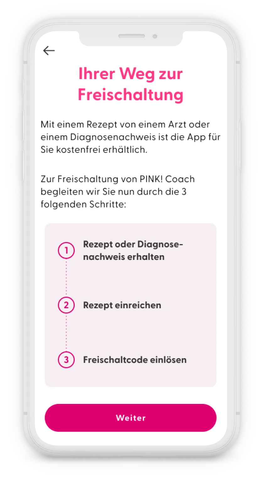
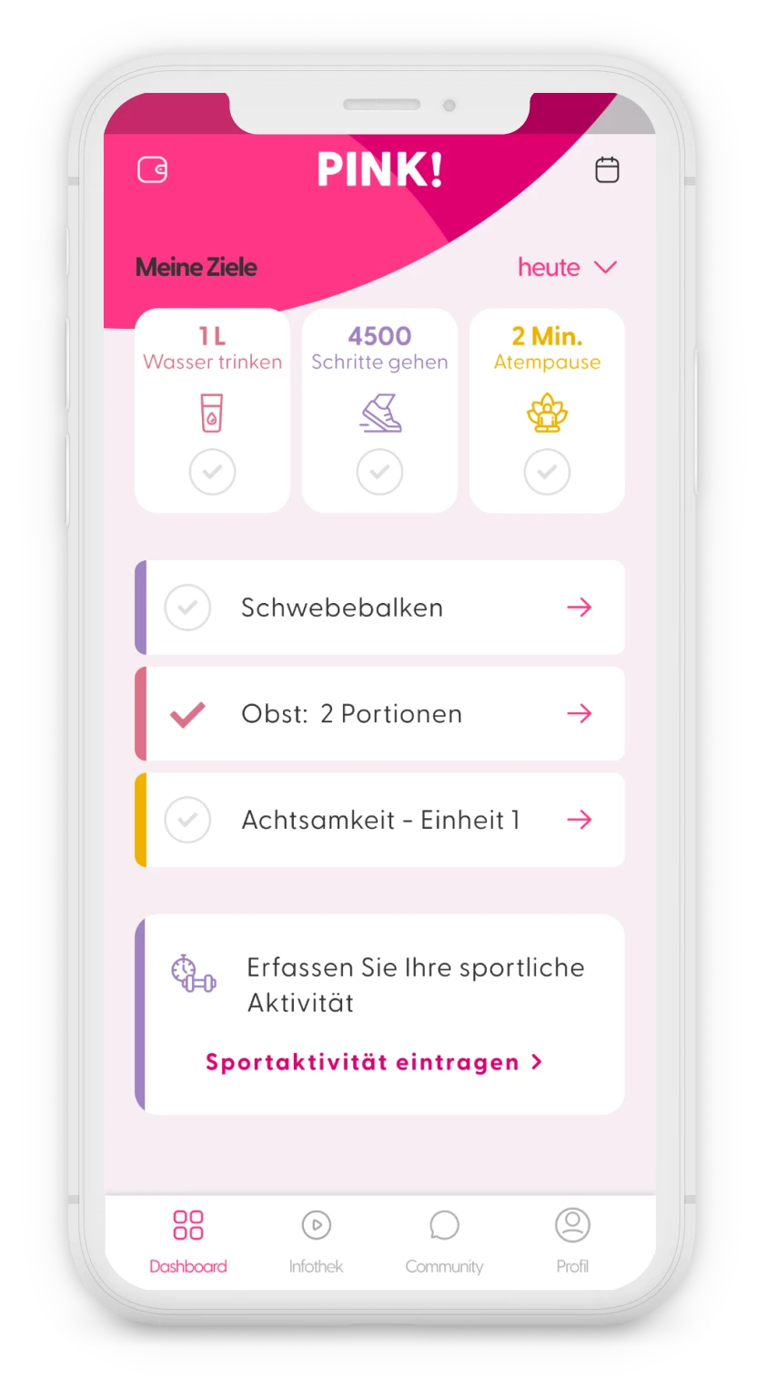
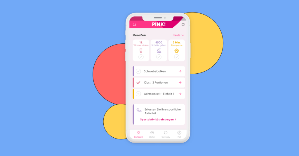
The App
Project Context
The app PINK Coach had been listed as a DiGA (Digitale Gesundheitsanwendungen or Digital Health Application) for one year and was in the process of becoming permanently listed.
The business model of DiGAs depends on three crucial steps:
- the prescription of the app by doctors
- the approval by health insurance companies to cover the costs of the app
- the user receiving and redeeming the code in the app.
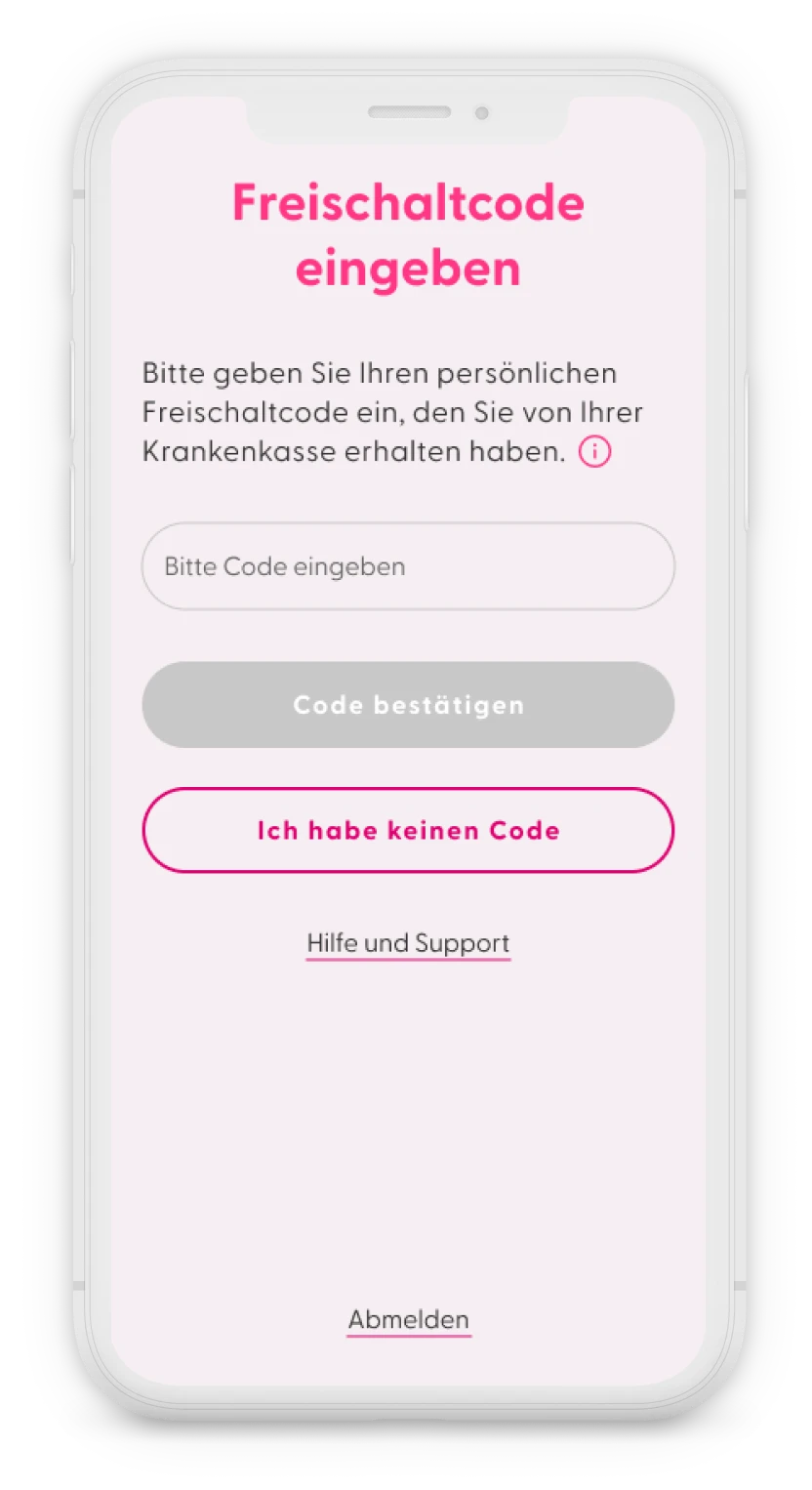
DiGA manufacturers receive payment from public health insurances only after the activation code is successfully redeemed within the app. Users with private health insurance usually purchase the activation code directly from Pink’s website and get reimbursed.
At the time, it was well known in the DiGA manufacturer community that obtaining the activation code is a significant challenge for users:
- Prescription issues: Users first need to find a doctor willing to prescribe the app. Many doctors are unfamiliar with DiGAs and may hesitate to prescribe them.
- Health insurance complications: After getting a prescription, users have to submit it to their health insurance. With so many insurers in Germany, each with its own process, this can be difficult. Some insurers take longer to issue codes and might even suggest cheaper alternative apps.
- Rejection from health insurances: In some cases, insurers may reject the request entirely, leaving users without guidance on how to claim their DiGA rights.
Since this whole process of obtaining an activation code happened offline, it was hard for PINK! to measure how many people try to get the code and give up because it’s too much effort.
The main goal of this project was to reduce friction and increase the number of activation codes redeemed in the app.
Roles and responsibilities
- 1 senior product manager
- 1 senior product designer (me)
Process
1. Discovery & Definition
We started collecting data on the process of obtaining the activation code, from the following sources:
- Usage data (ex. number of users registered in the app vs. number of activation codes redeemed)
- Data from other DiGA constructors and the Spitzenverband Digitale Gesundheitsversorgung
- Reports from user interviews conducted in 2021 and 2022.
- User feedback received by customer service.
The following pain points were identified, in the discovery phase:
- Stuck before the activation code step: Many users register in the app but get stuck at the activation code step (paywall) and cannot use the app.
- Unclear next steps: Users know they need a prescription but are unclear on how to proceed once they have it.
- Confusing navigation: Instructions for obtaining the activation code are only available on the website, causing confusion when users have to leave the app and struggle to return.
- Excessive effort: Users, who are already fatigued and unwell, find it exhausting to contact their health insurance and persuade them to cover the app’s costs
Based on these findings, we reframed the problem in a how might we question:
How might we simplify the process of obtaining an activation code for the PINK! Coach app, so more breast cancer patients can benefit from the app, and PINK! can increase its revenue?
2. Ideation
Six months before I joined the project, there were discussions about creating a system where users could email their prescriptions or proof of diagnosis to customer service, who would then handle contacting the health insurance. However, I wasn’t involved in this phase, and the feature was never launched because our data protection officer advised against it due to the lack of encryption, making email an unsafe method for sharing medical data.
As a result, discussions shifted toward finding a more secure solution, ideally an in-app feature hosted directly on our servers.
When I joined the project in September 2023, I advocated for exploring solutions beyond simply uploading files in the app.
I saw an opportunity to better guide users by providing tailored information rather than overwhelming them with a page on the website containing a large amount of content and expecting them to find what matched their situation.
This should reduce requests and questions sent to the customer service. Additionally, this approach would allow PINK! to collect valuable data about the user, in the process, and offer personalised support based on their specific needs.
The idea was to begin the flow by asking users a few questions about their health insurance and their current stage in obtaining the activation code, so we could provide tailored guidance based on their specific situation.
The product team as well as the leadership team agreed, that this would add value to the business and accepted to increase the scope of the project.
3. Prototyping
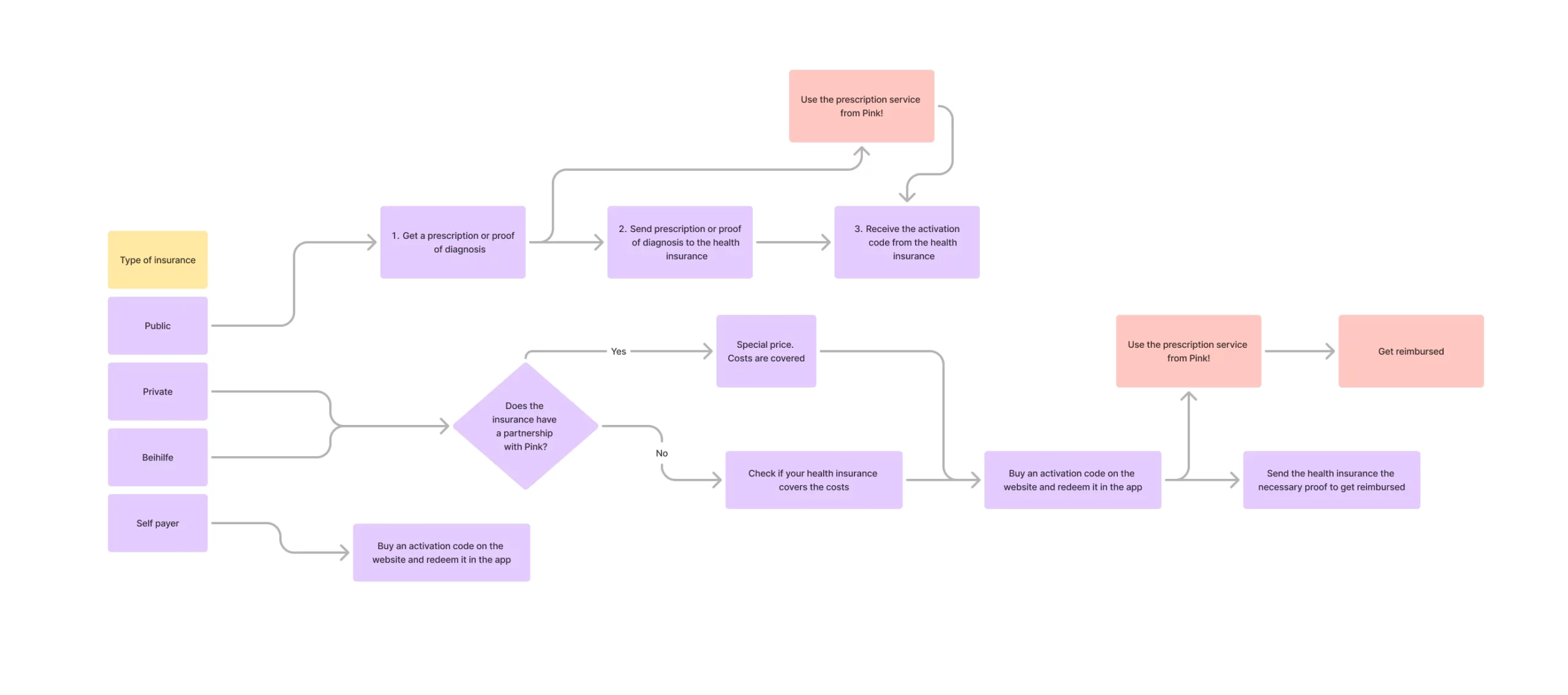
Once we were all aligned on the project, the product manager and I started listing the different kinds of flow there were to obtain an activation code, depending on the type of insurance the users had.
We came up with 4 different groups of users, and mapped out a flow for each group:
- Publicly insured
- Privately insured
- Privately insured with ‘“Beihilfe”
- Self payers (users not insured in Germany)
For each user group, the process for obtaining an activation code varied. However, we identified six key steps that were common across all groups. Based on their responses to the questionnaire, different content would be displayed to each group.
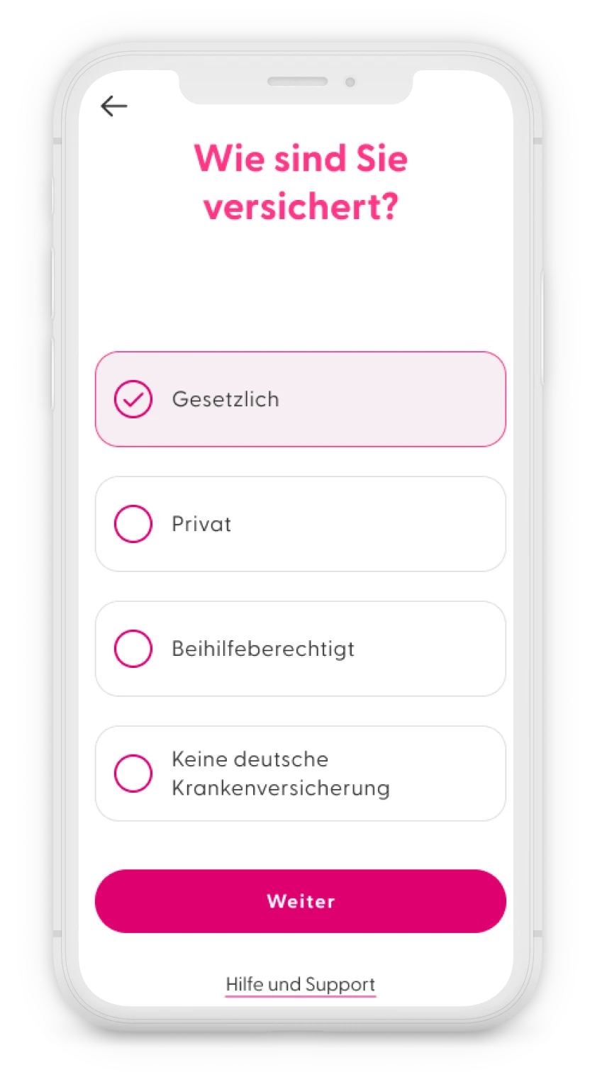
- Type of health insurance
To provide better guidance through the process, we needed to ask users first about their type of insurance. Depending on the type of insurance, we showed them all the necessary steps to obtain an activation code, with a maximum of four steps to keep it simple. - Medical report or prescription
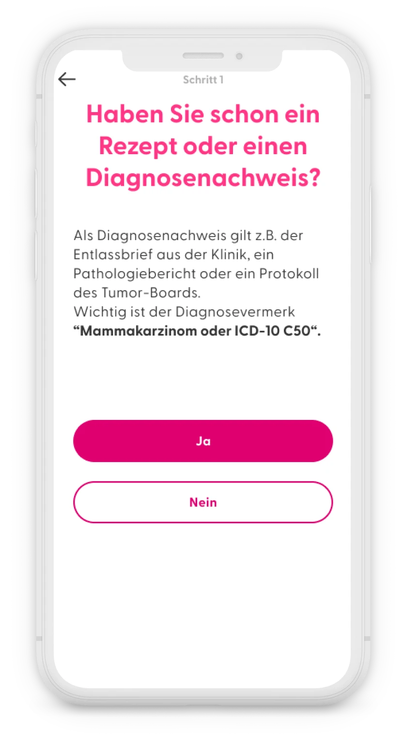
In both the public and private insurance journeys within the app, the first step was to obtain a medical report confirming a breast cancer diagnosis or a prescription from a doctor. The app logically asked, “Do you have a prescription or proof of diagnosis?” If users clicked “no”, they were directed to a screen with information on how to obtain a prescription, along with downloadable documents to show their doctor. However, in the privately insured flow, users needed to first confirm with their health insurance whether the app’s costs would be covered. - Prescribing doctor
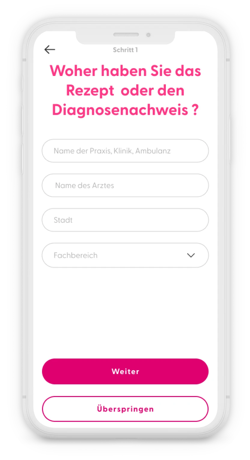
Following some requests from leadership, we added some optional questions, for users who already had a prescription about which practice and doctor prescribed the app to better track which practices were prescribing the app. These questions could be skipped. - Advancement steps
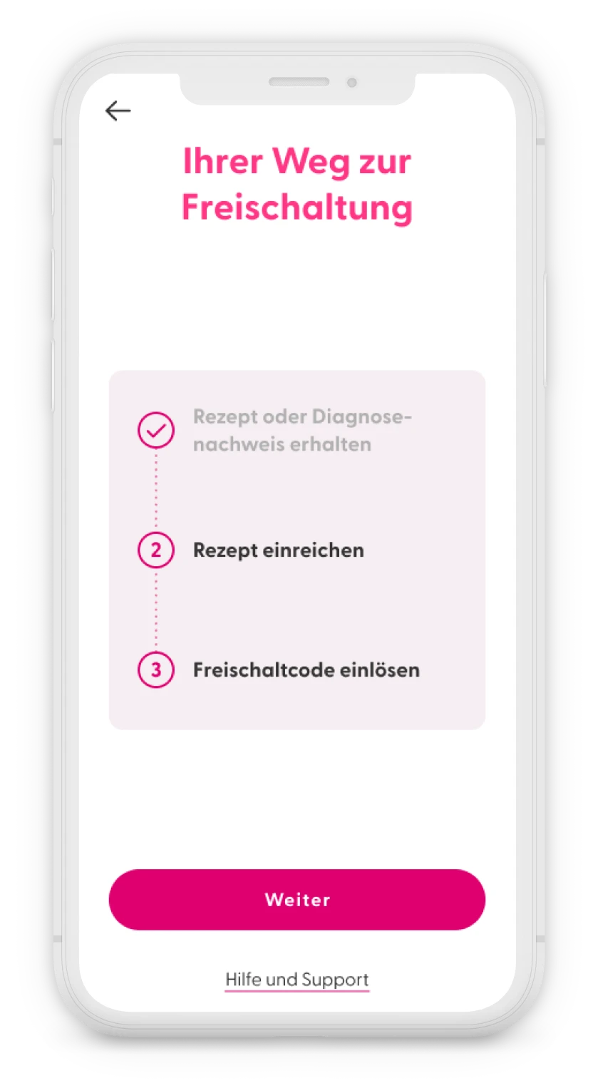
After each step was completed, I suggested adding a screen that visually displays all the steps, with the completed ones clearly differentiated. This approach not only guides users through the process but also gives them a sense of accomplishment as they progress. - Send the prescription to the health insurance
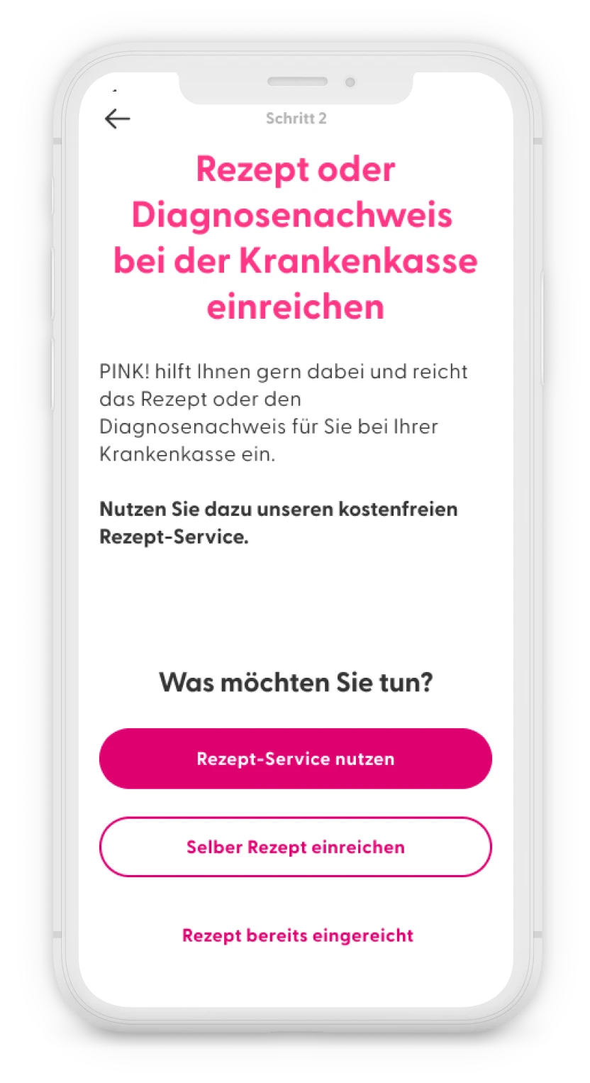
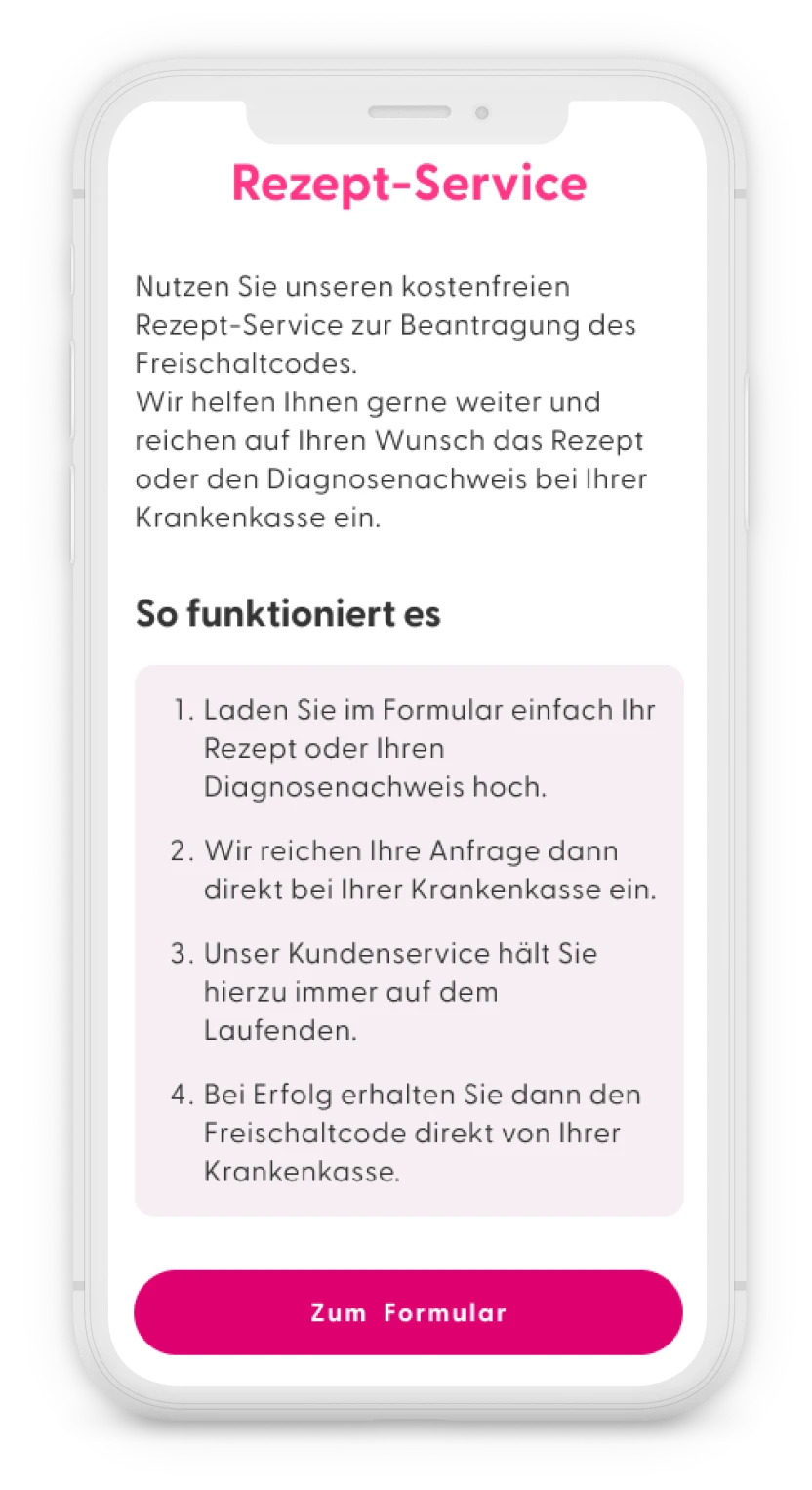
Then we would explain that they had to send information to their health insurance and introduce the “Rezept Service” or prescription service that they could use to simplify the process.
They still had the option to take care of this formality on their own and could activate this service later if the health insurance was taking too long to reply. - Prescription service
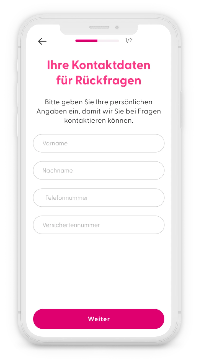
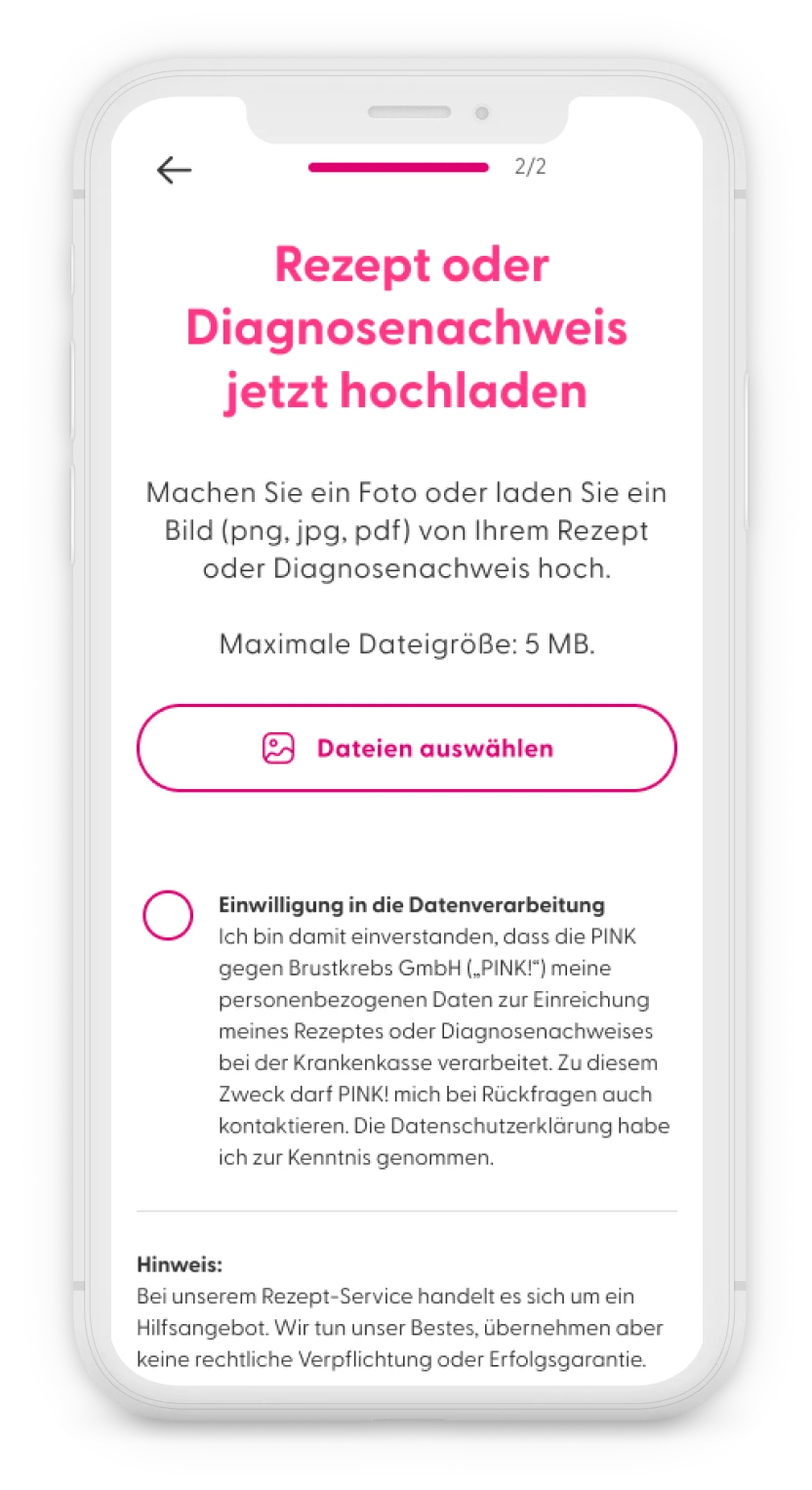
The feature required to collect some contact information and the insurance number, in order to send the request to the health insurance and to follow-up with the user if any additional information was needed. The last step was to upload the proof of diagnosis or prescription, with the possibility to either pick a document on the phone or take a photo.
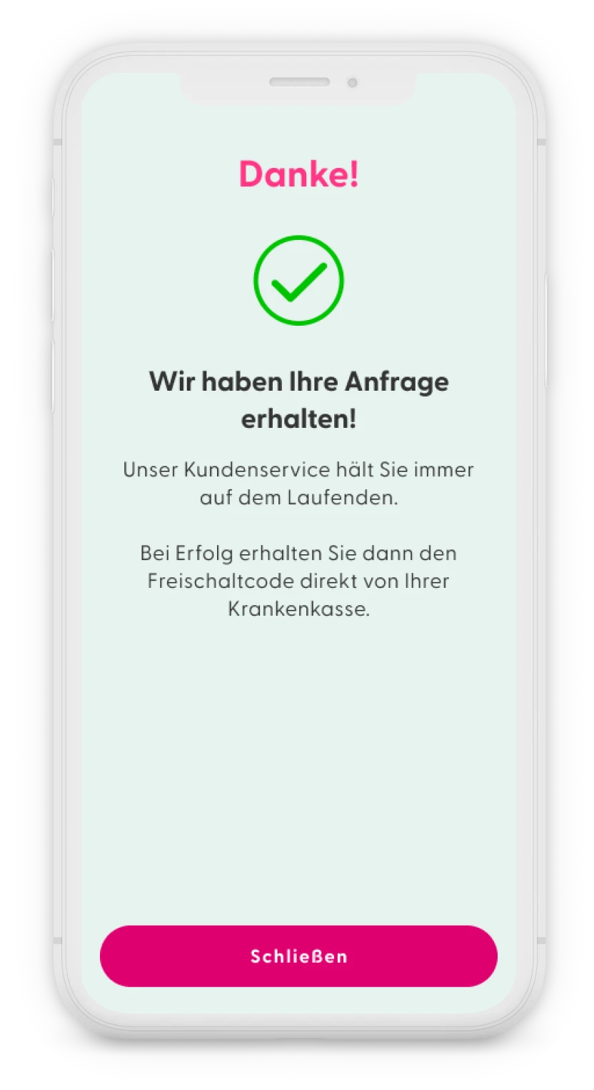
The flow ends with a confirmation screen, that their request has been received and takes them back to the screen with the activation code.
The customer service would then keep the user informed of the process through email.
After mapping out all the different journeys to get the activation code, the product manager and I reviewed them all and decided to simplify some parts and merge the Beihilfe journey with the privately insured journey as they were quite similar.
User journey for publicly insured users in the app PINK! Coach.
Read from top left to right and then bottom left to right.





5. Validation
We conducted unmoderated user tests on the new flow, and users found it easier to navigate. Most participants expressed trust in PINK! to handle their medical and personal data securely and were willing to use the prescription service.
Measuring success
Primary Metrics
To measure the success of this new feature, we should observe the following key metrics:
- Increase in redeemed activation codes:
Track any increase in the number of activation codes redeemed over time. - User engagement with prescription service:
Track how many users use the in-app prescription service out of the total number of new app users who sign up after the feature launch and have not yet redeemed an activation code. - Reduction in customer support inquiries:
Assess any decrease in customer support inquiries related to obtaining activation codes or submitting prescriptions. - Reduce drop-off rate:
Decrease the number of users who stop using or delete the app after registration
Additional Metrics to Monitor
- Time to code activation:
Monitor the average time it takes for users to receive and activate their codes after submitting their prescription through the app. - Successful prescription submissions:
Measure the percentage of prescriptions or proof of diagnosis submitted through the app that result in users receiving an activation code or obtaining approval for cost coverage for privately insured users. - Error rate:
Measure the percentage of failed submissions or issues encountered during the prescription process. - Drop-off:
Analyse where users abandon the prescription submission process, helping to identify potential friction points. - Health insurance provider engagement:
Monitor the responsiveness and willingness of different health insurance providers to cooperate, identifying which providers are faster and more proactive in processing submissions.
Outcomes
The designs were handed over to the software engineers in October 2023. However, the feature was not launched until June 2024 due to a shift in priorities.
I had already left the company by the time of the launch and no longer have access to the database. For privacy reasons, this data cannot be shared with external parties.
It is still too early to fully measure the impact of this new feature on the business, but I am confident that it has provided valuable insights and eased a significant burden for patients.